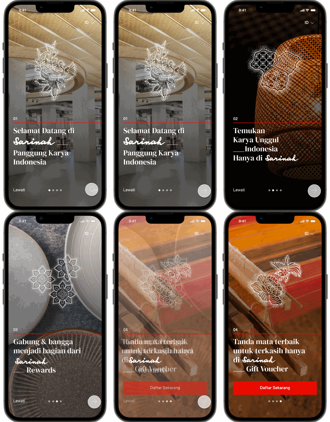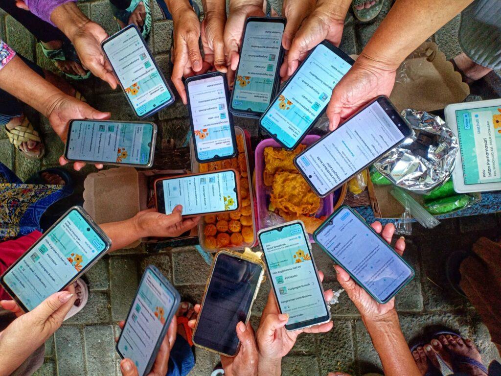
In Indonesia, where there is a shortage of healthcare professionals, community health workers, or cadres, play a vital role as to support delivery of Primary Healthcare Services in Indonesia. This project aims to empower cadres with digital decision support tools to help them perform their jobs better in serving the community.
The Impact
As of 30 June 2025, the app has been downloaded and activated by 2,230 cadres, out of a total 2,351 registered cadres (95% activation rate) in Keerom and Surabaya. Among them, 1,442 cadres (64%) have actively used the app to record real community health data. Through the impact evaluation, we started seeing behavioral changes shown by cadres (e.g., more accurate & complete health data input, more confidence in providing advice and referrals) and by the community (e.g., exercising and adjusting their diets after reviewing their screening results).
Our Approach
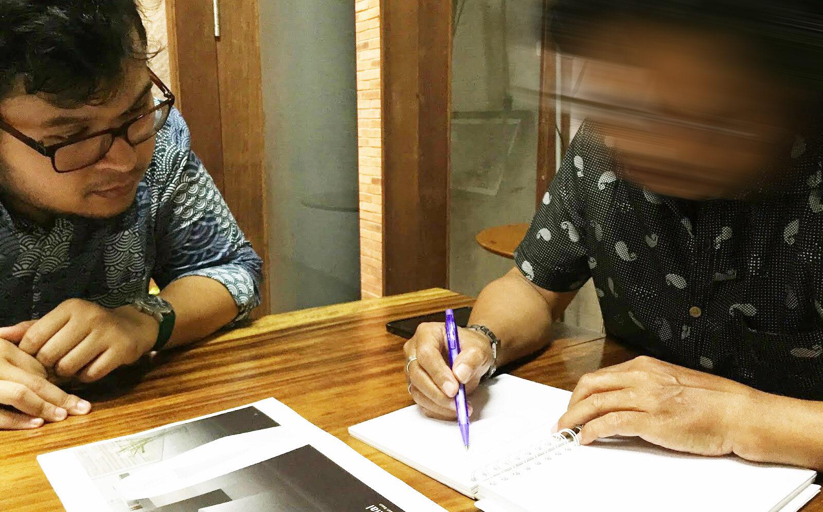
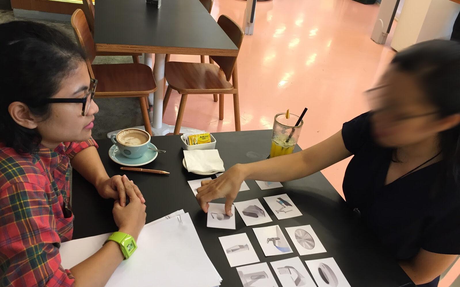
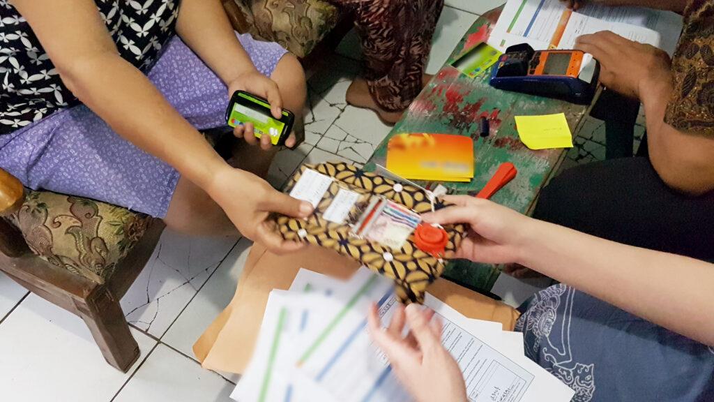
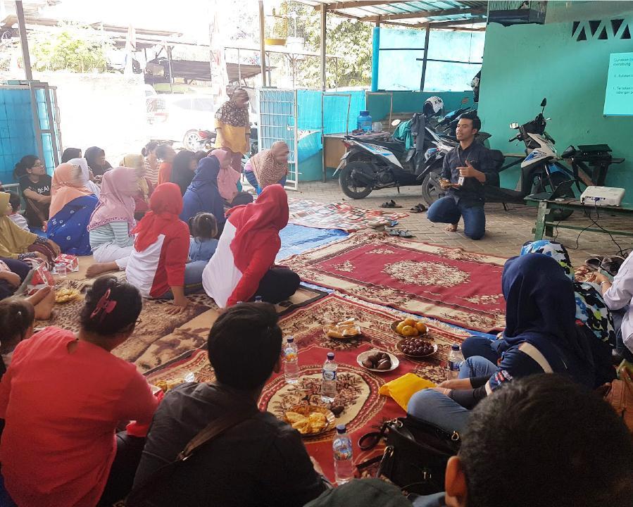
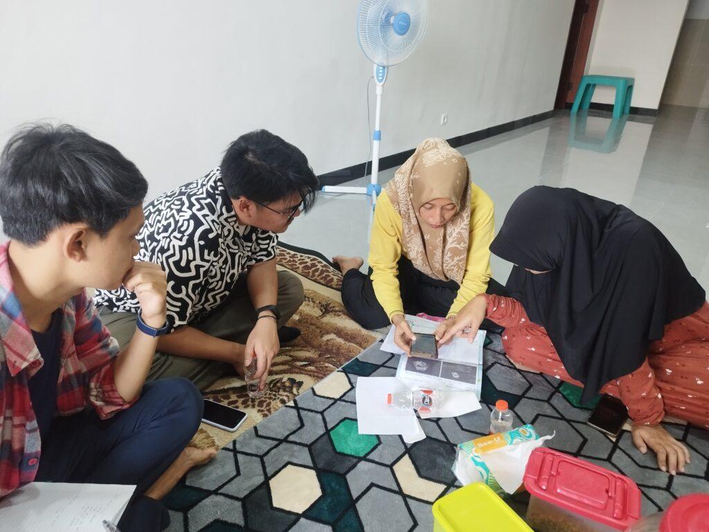
We started by listening deeply through interviews, observations, and co-creation sessions with cadres, healthcare professionals, and key stakeholders — from local leaders to the Ministry of Health. These insights shaped our design of a digital decision support tool, in the form of a mobile app for the cadres, and monitoring dashboard for local leaders and healthcare professionals. The tools were then implemented in Keerom, Papua and Surabaya, East Java. We built support systems (training sessions, video tutorials, and WA) to help cadres feel confident and capable in using the tool. And to understand the real impact, we used the ‘Most Significant Change’ framework and mapped stories from cadres, communities, and supervisors with Theory of Change.
Our Journey and Process
Immersion & co-creation
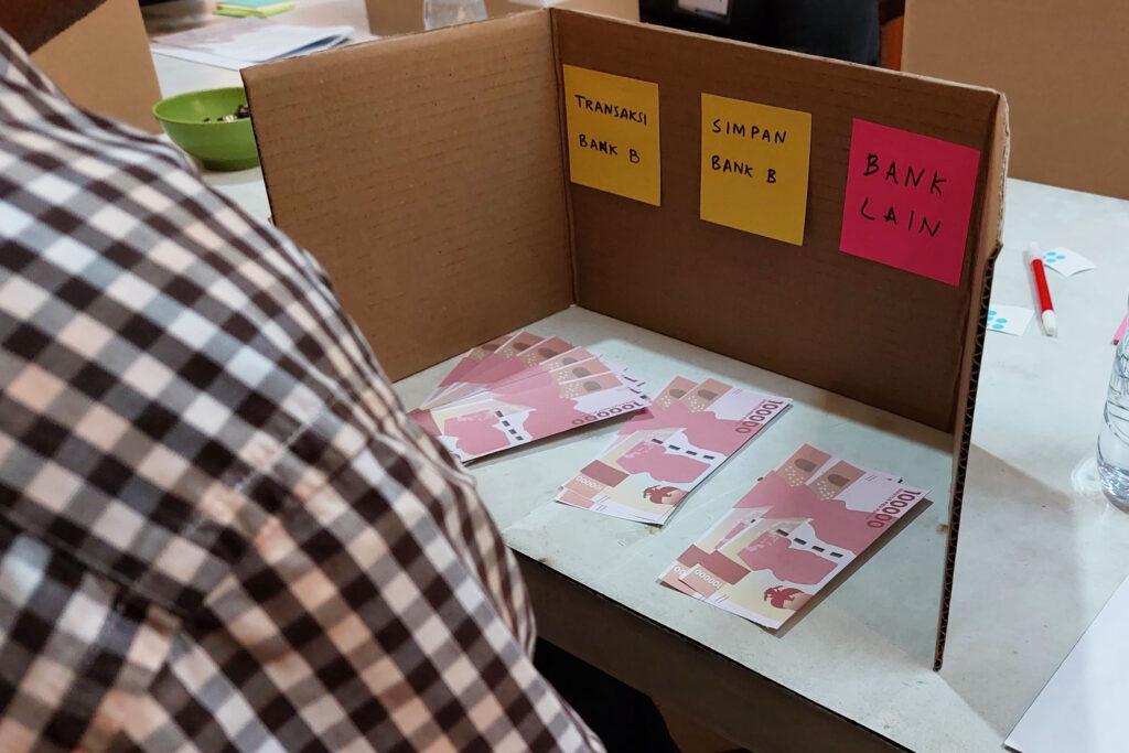
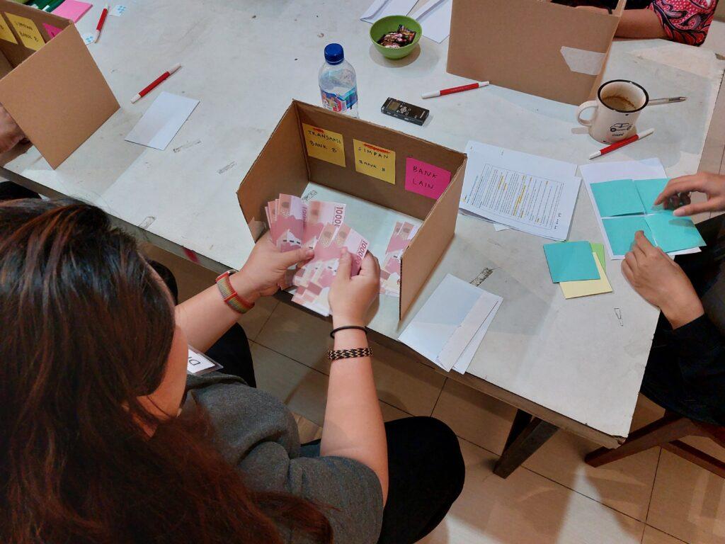
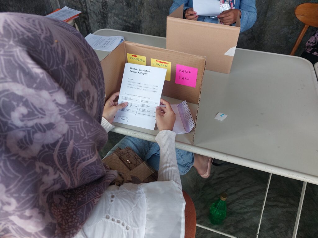
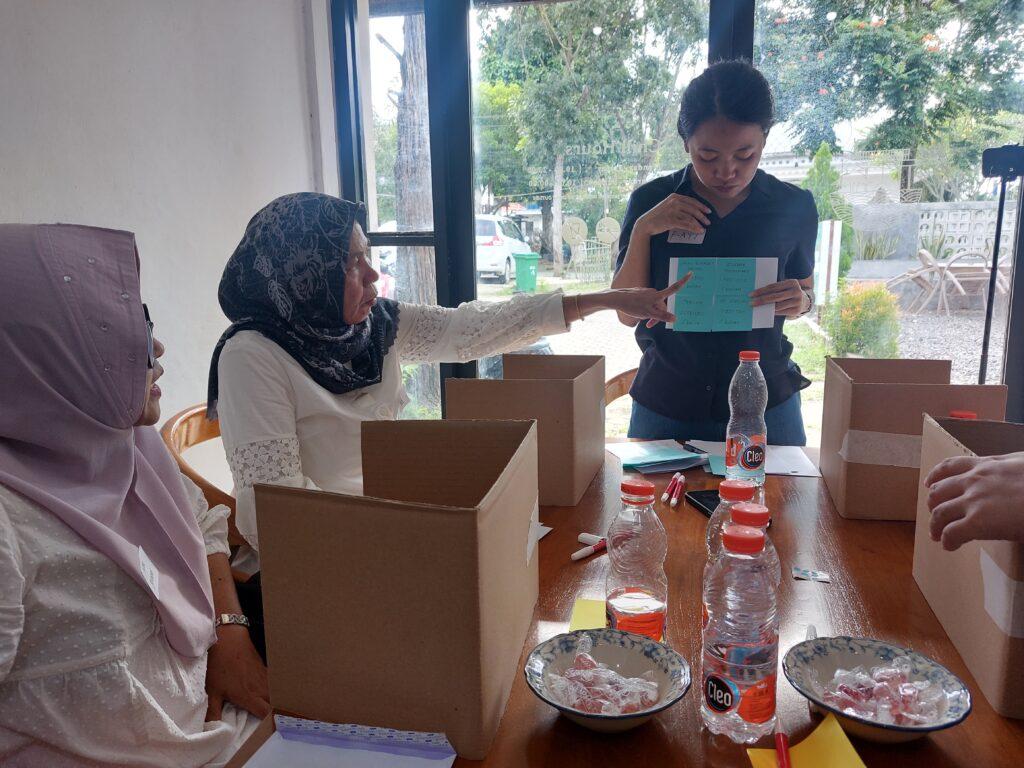
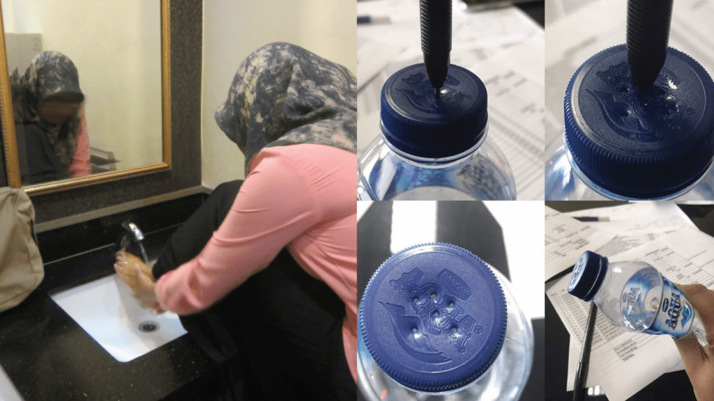
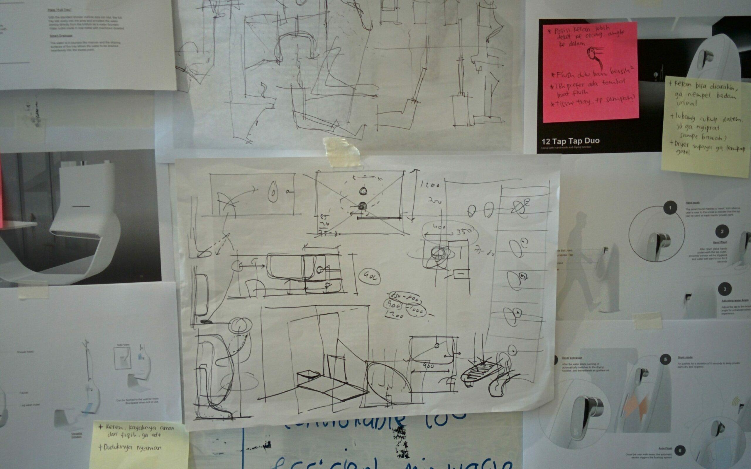
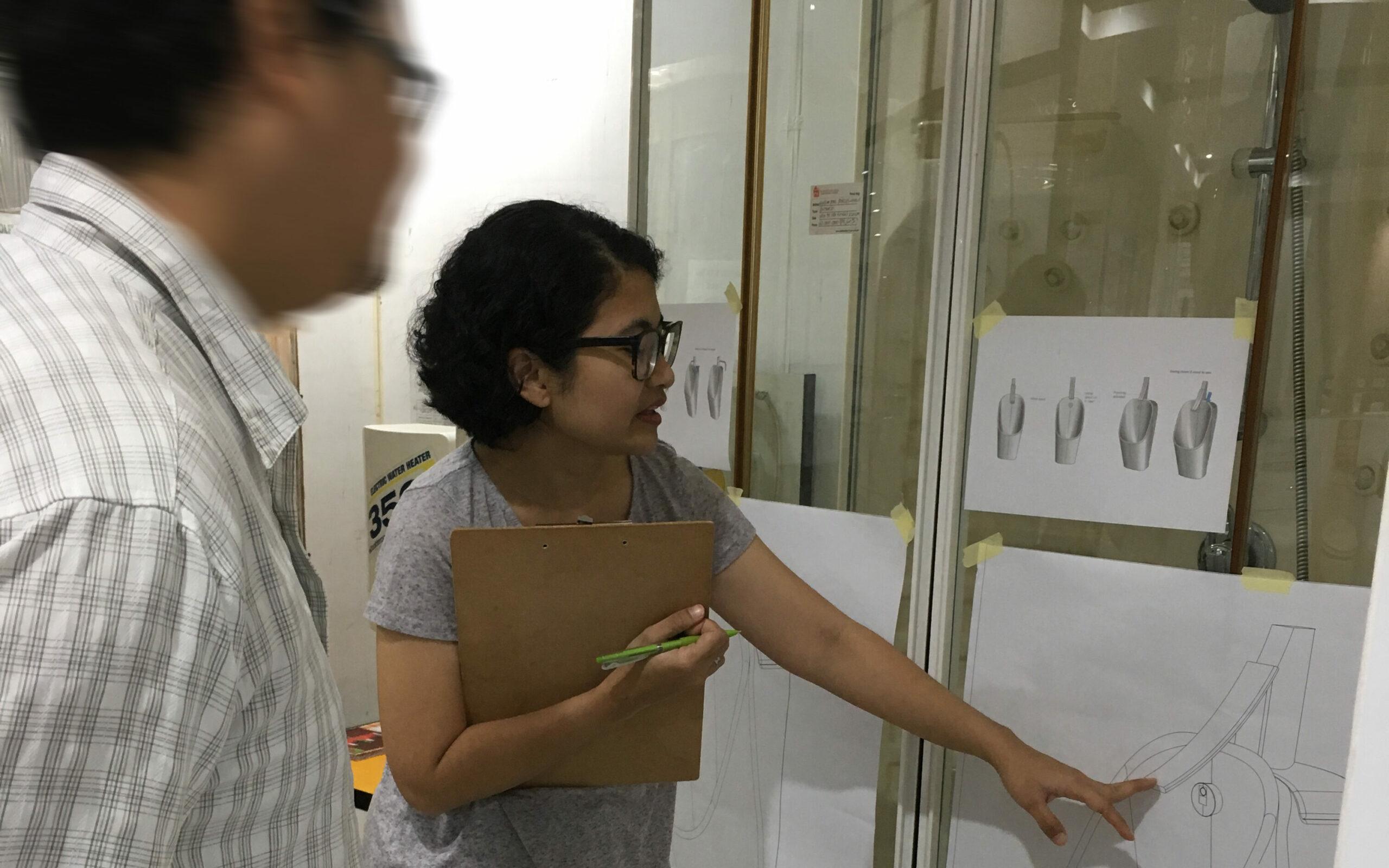
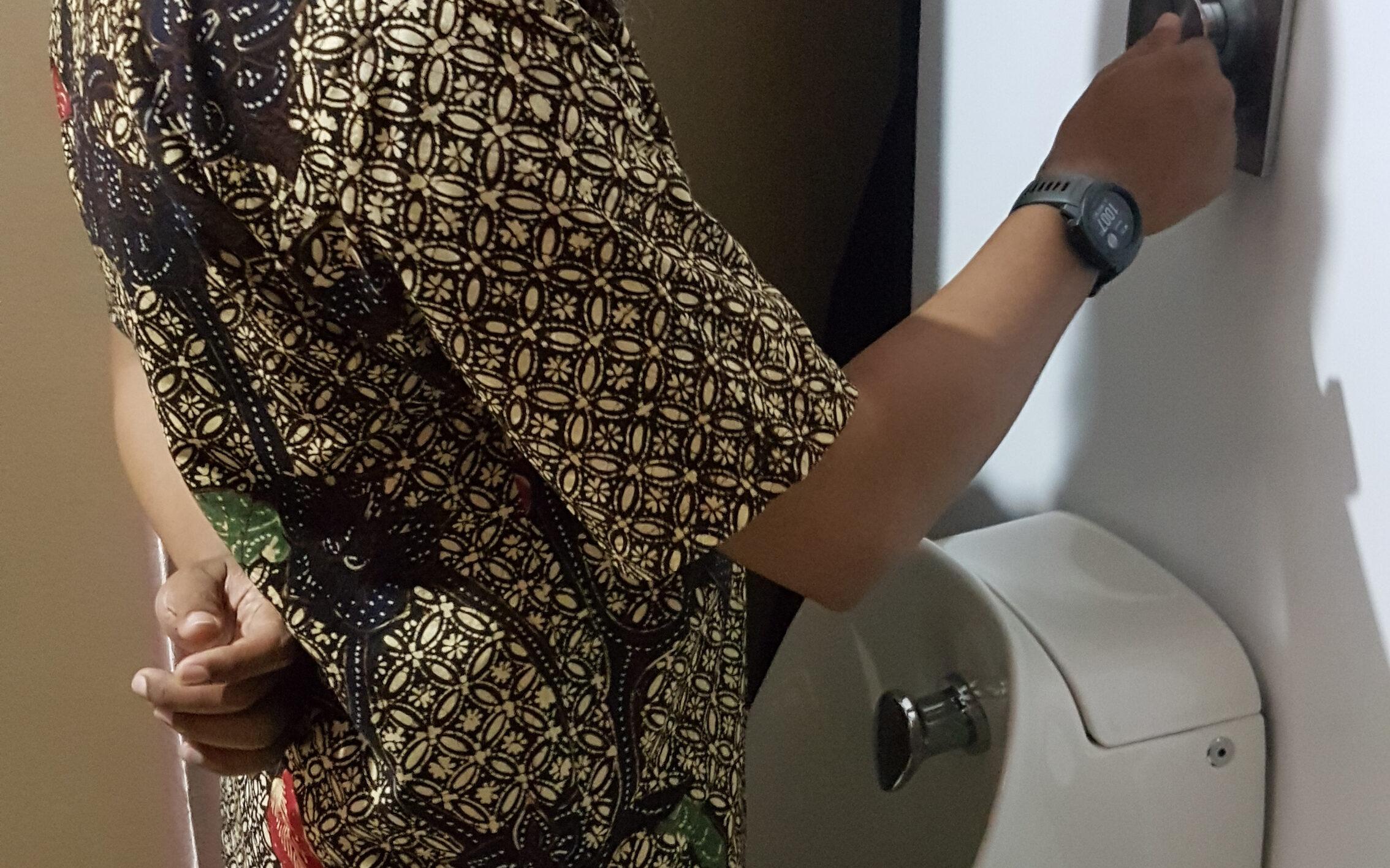
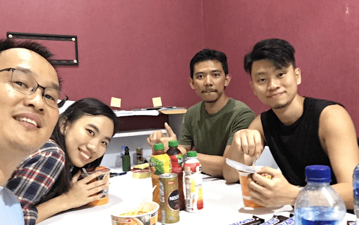
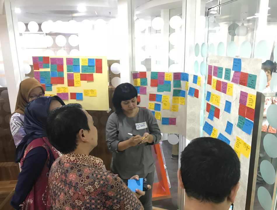
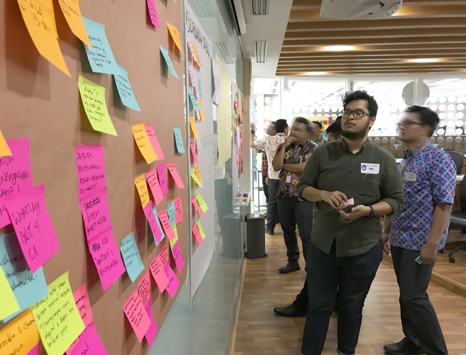
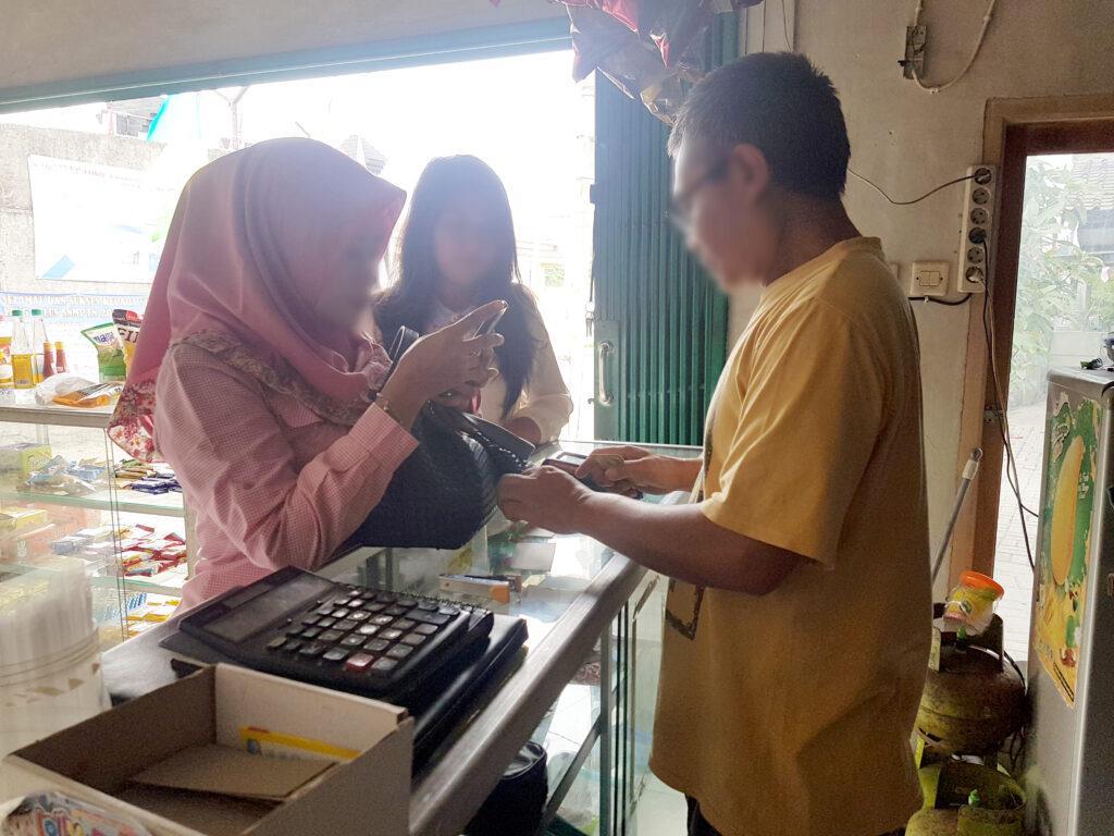
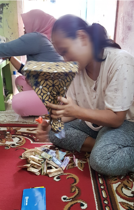
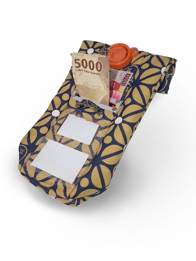
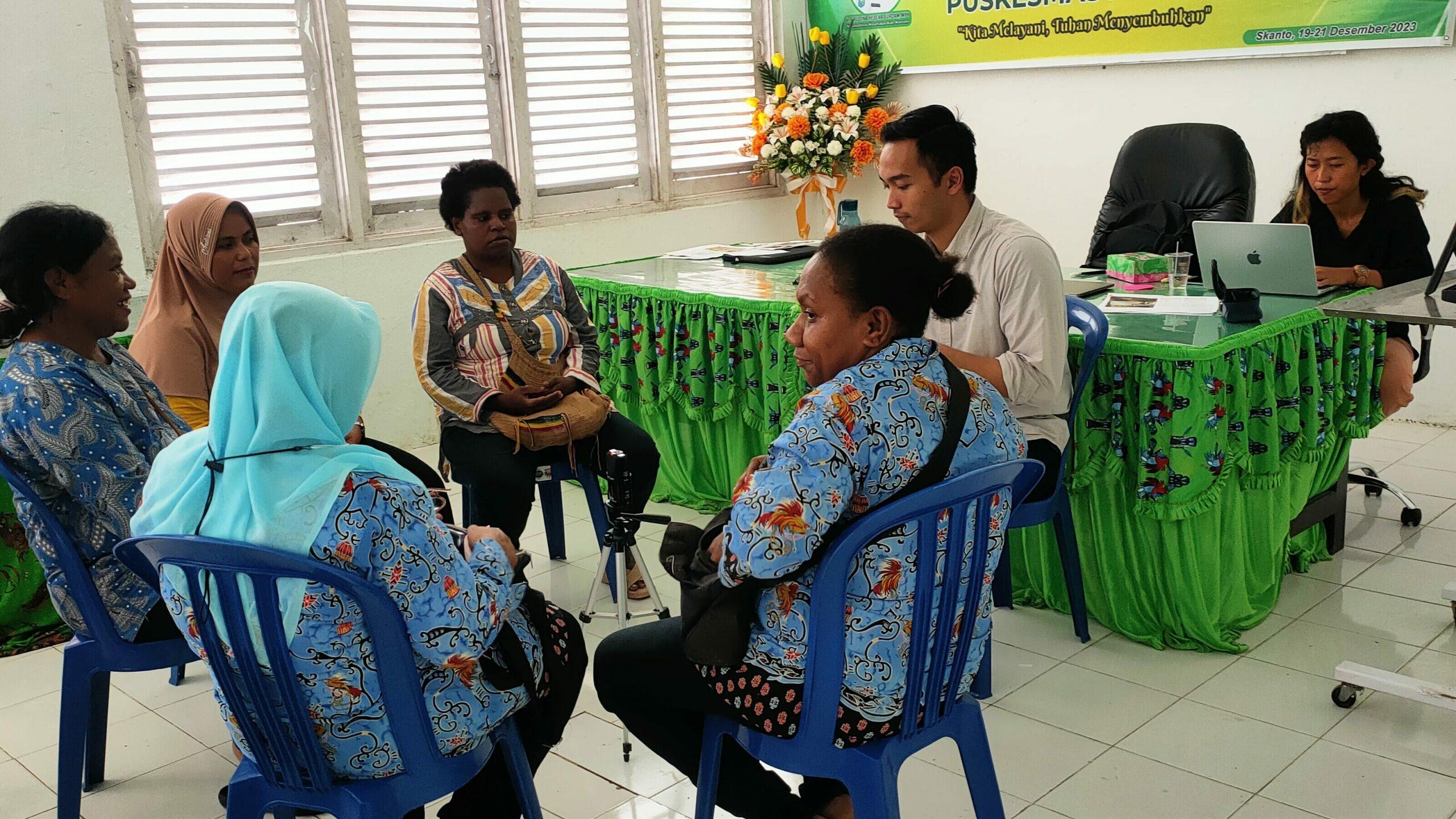
We began by mapping the Primary Health Care systems in Indonesia and the roles of cadres through a co-creation workshop with the Ministry of Health and Center for Data and Information Technology. We then immersed ourselves into the world of cadres, through observations, interviews, and co-creation sessions with cadres, healthcare professionals, as well as local leaders, District Health Offices in rural Keerom (Papua) and urban Surabaya (East Java). The insights shaped our understanding and helped us envision how a digital tool could help empower cadres to do their work easier and more effectively. We created systems maps, personas, concepts, and envisioned future scenarios.
Design & development
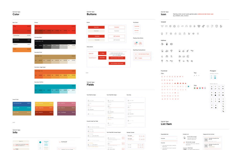
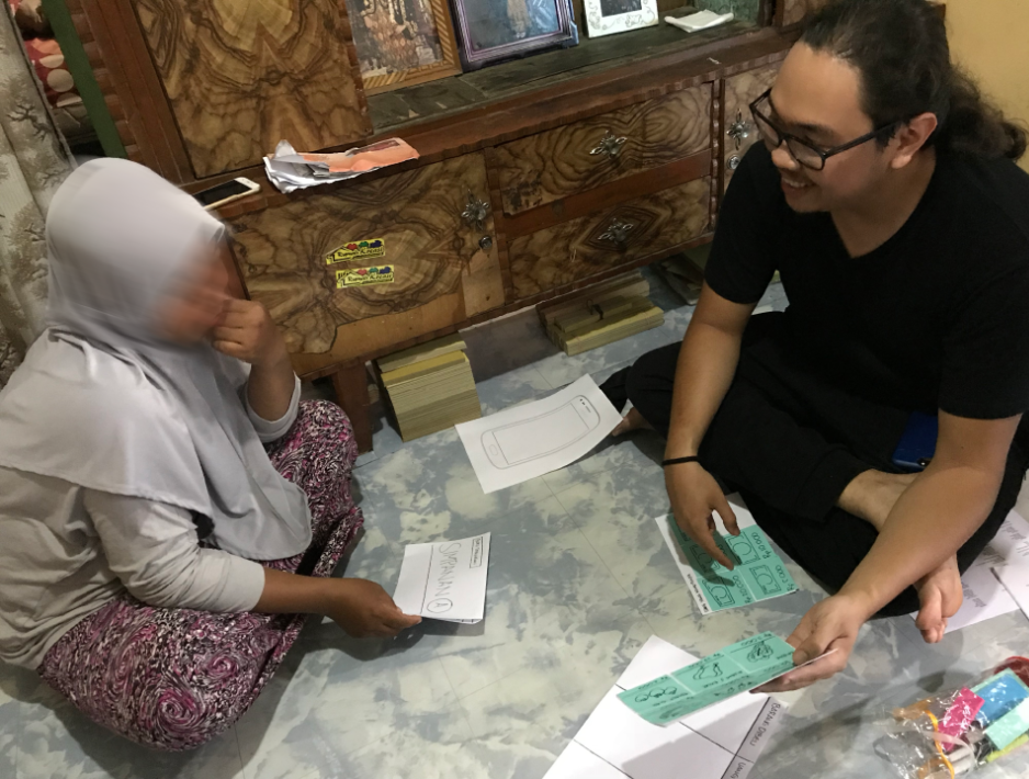
We then designed wireframes of the digital tool, and tested the low-fidelity prototypes with cadres and stakeholders in Keerom and Surabaya. Based on the learnings, we iterated the design and created high-fidelity UI design. We also worked closely with the Health Promotion team of the Ministry of Health to translate the latest health survey forms to ensure the content aligns with national standards, and with the local District Health Offices to include local needs from each specific area. Together with our development partner, we developed the mobile app for cadres and monitoring dashboard for local leaders.
Implementation
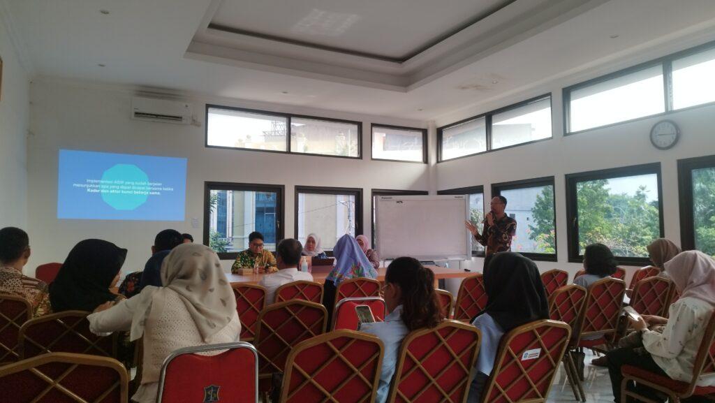
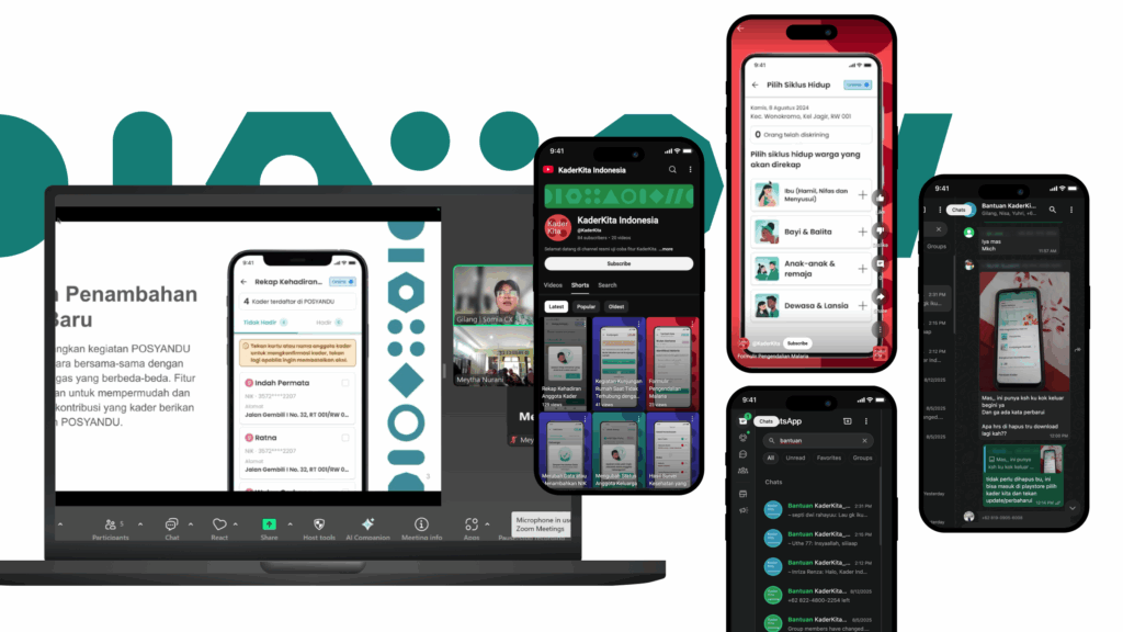
The tool was implemented in Keerom and Surabaya. To support this, we created a change management strategy, developed the trainer program, and involved key leaders to endorse and encourage the tool. To help cadres feel confident and supported, we created a support system, including training series, Help Desk via WhatsApp, video tutorials, online guide and FAQ site.
Impact evaluation
We gathered stories from 88 cadres, supervisors, and community members in Keerom and Surabaya to evaluate the impact of the digital tool, using the Most Significant Change framework. Through this, we identified initial behavioral changes, such as improvements in cadres data input and health monitoring, and higher confidence in providing advice and referrals backed by the app’s decision support features.
The Results
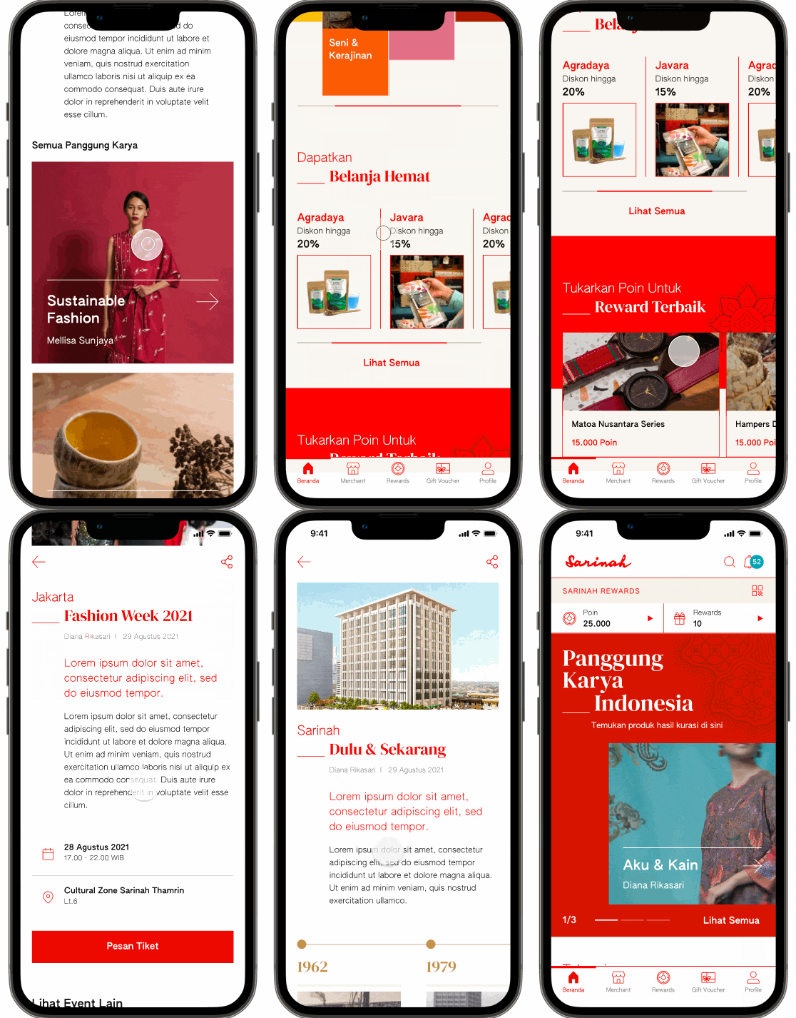
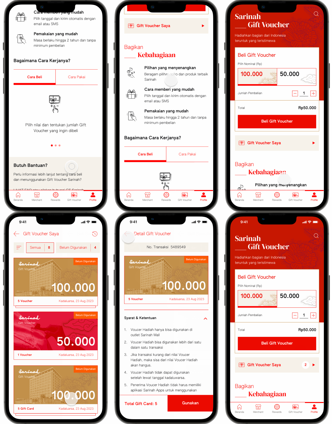
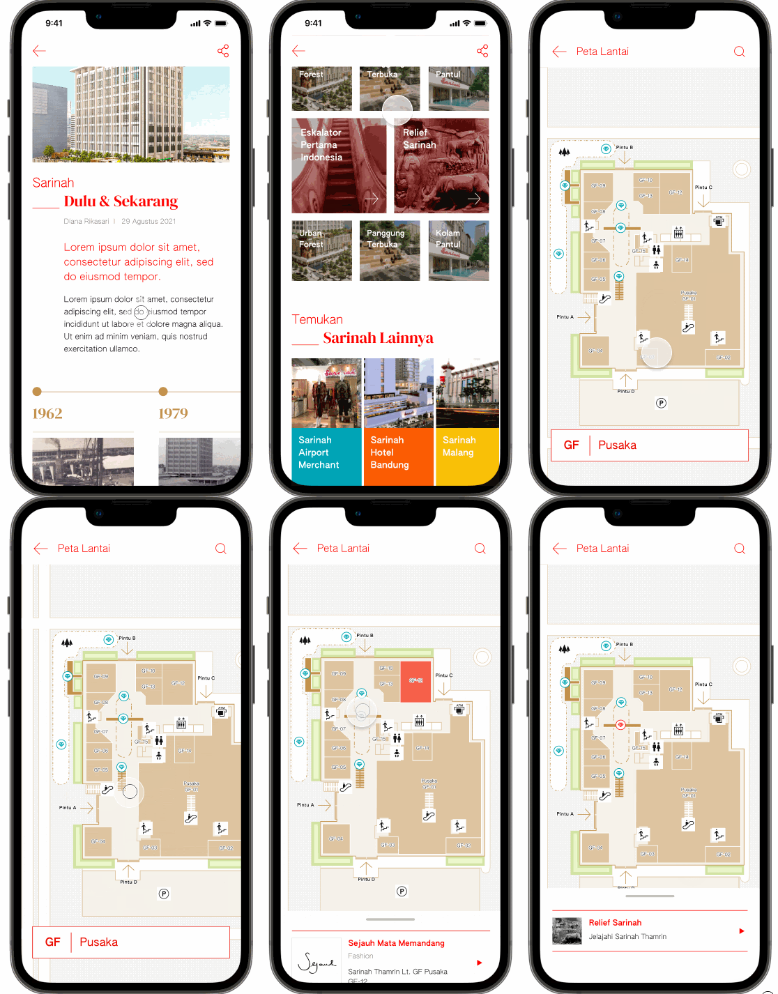
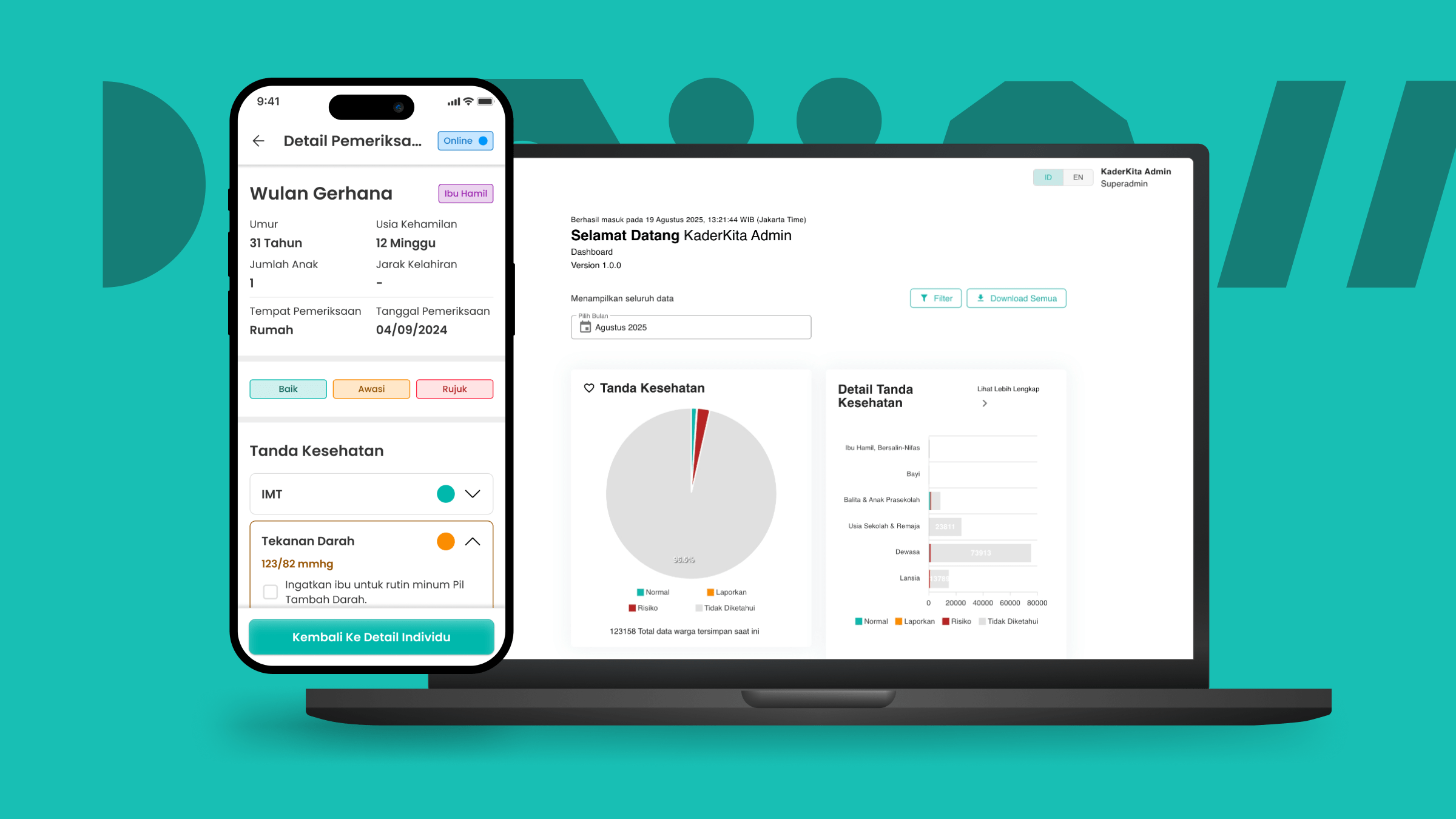
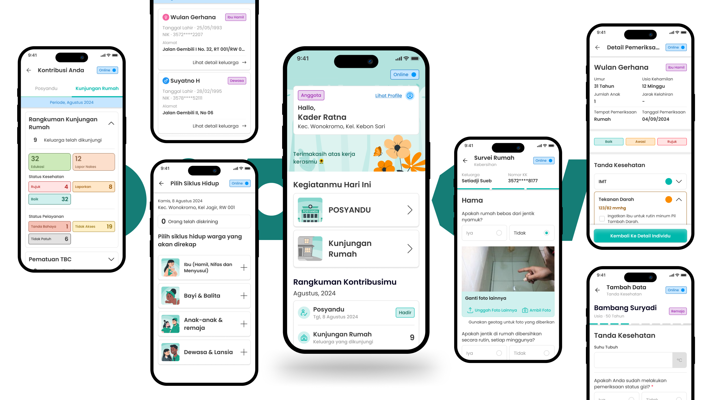
We built a digital decision support tool, in a mobile app, with key features including:
- Offline mode for areas with low connectivity, like rural Keerom in Papua
- Community data recording and health screenings at Posyandu and home visits for every life stage, from pregnant mothers and babies to the elderly, as well as family and home risk assessments. All these complete with status indicators and recommendations for referrals
- Tools for cadres to track their performance and key contacts for emergencies
- Learning modules covering 25 core competencies for integrated primary healthcare, helping cadres grow and improve.
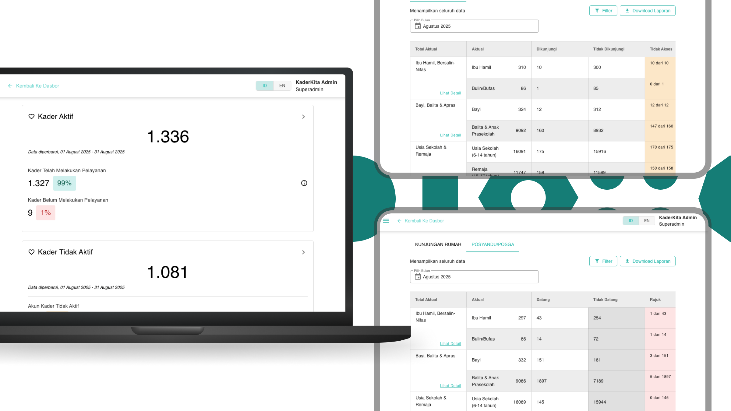
We also built a dashboard monitoring and content management system. It gives health offices and local leaders a clear view of health status in each area, cadres’ activities and performance, and community data. It also helps manage health content and user access seamlessly.
Awards & Recognitions
We are very honored and humbled that the KaderKita project won in:
Consultant in-charge

Ketut Sulistyawati
Project Oversees

Bhagaskara Setiawan
User Researcher

Gilang Nur A’idi
Interaction Designer

Ryan Nugraha
Project Manager

Putri Purnomo
Lead Designer

Daniel Fandra
Research Ops
See more our similar works
Collaborate with us!
Looking for ways to transforming your business?
Get in touch with us!


