Designing a seamless experience for Kemdikbudristek’s website through user-centered information design
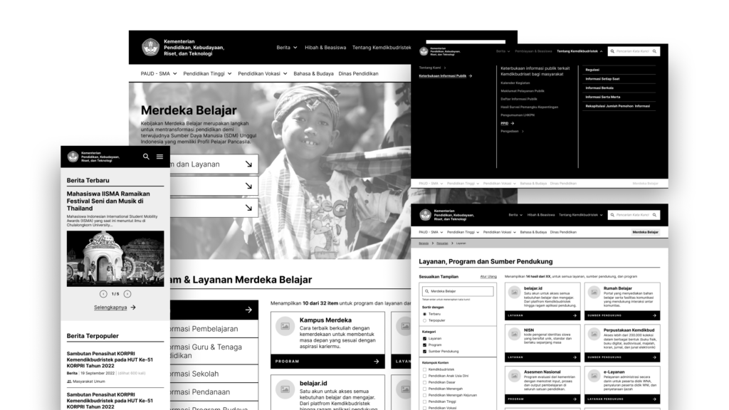
The transformations of the education system conducted by the Indonesian Ministry of Education (Kemdikbudristek) prioritize fast and accessible information dissemination. In response, the ministry wants us to help them adjust their main website portal so that it can be easily accessed by any stakeholder under their service.
The Impact
With the new directions, we treated the website as the main lobby. Providing its users with essential information and then guiding them to other detailed sources provided by the main department under Kemdikbudristek. The result is an information architecture with a concise and modular information structure that is still adaptable to accommodate future changes.
Our Approach
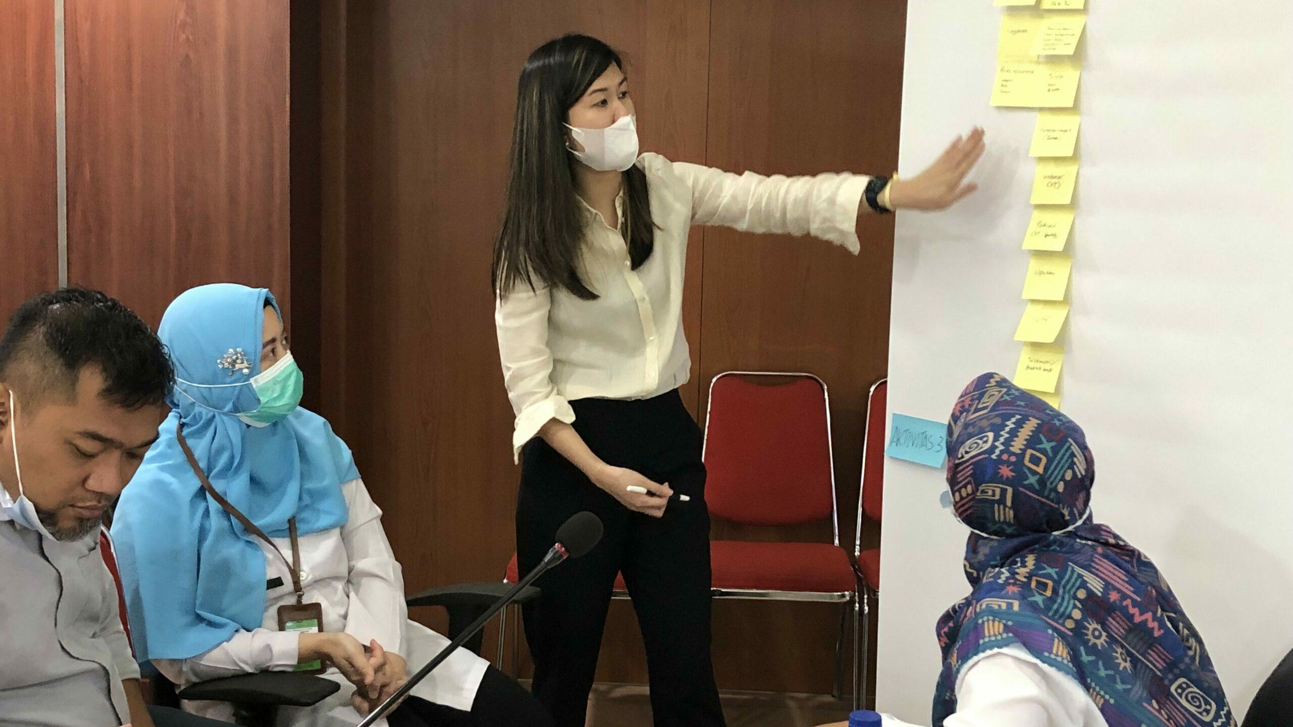
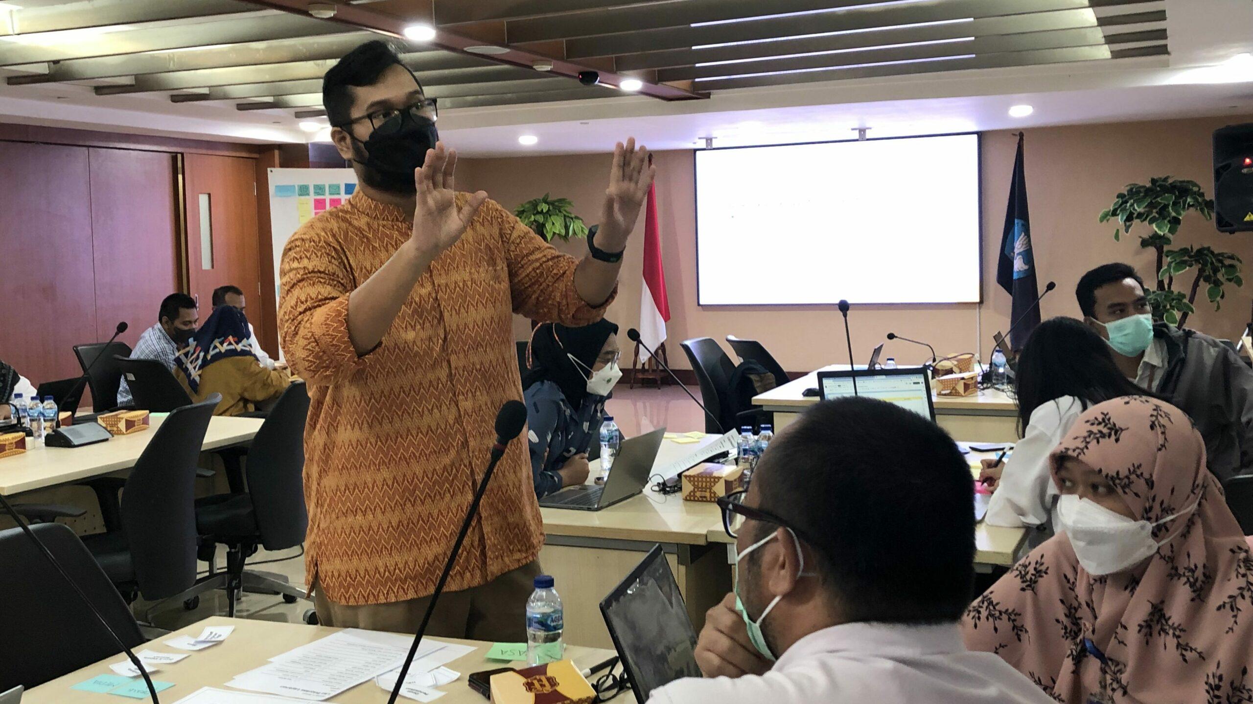
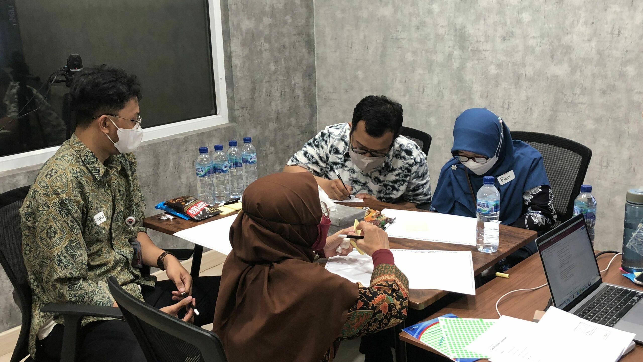
First, we need to gain buy-in from all involved stakeholders, including the main departments of the ministry. We began the project by understanding the main agendas of each department, the way they disseminate information, and the current information provided on the main website. Since the main goal is to make the website accessible to its users, we also conducted several FGDs (focus group discussions) to validate our findings and explore the needs and behavior of users seeking education-related information.
It is not easy to fulfill the needs of every stakeholder, especially with tight deadlines. Therefore, we decided to design around 20% of the information that is important for the remaining 80% of users while still providing room for future growth and development.
Our Journey and Process
Internal Context Gathering
We conducted this activity through an internal workshop with the 9 main departments of Kemdikbudristek. In addition, we gathered context by inventorying the information presented on the website to determine the type of content and the responsible department.
External Context Gathering
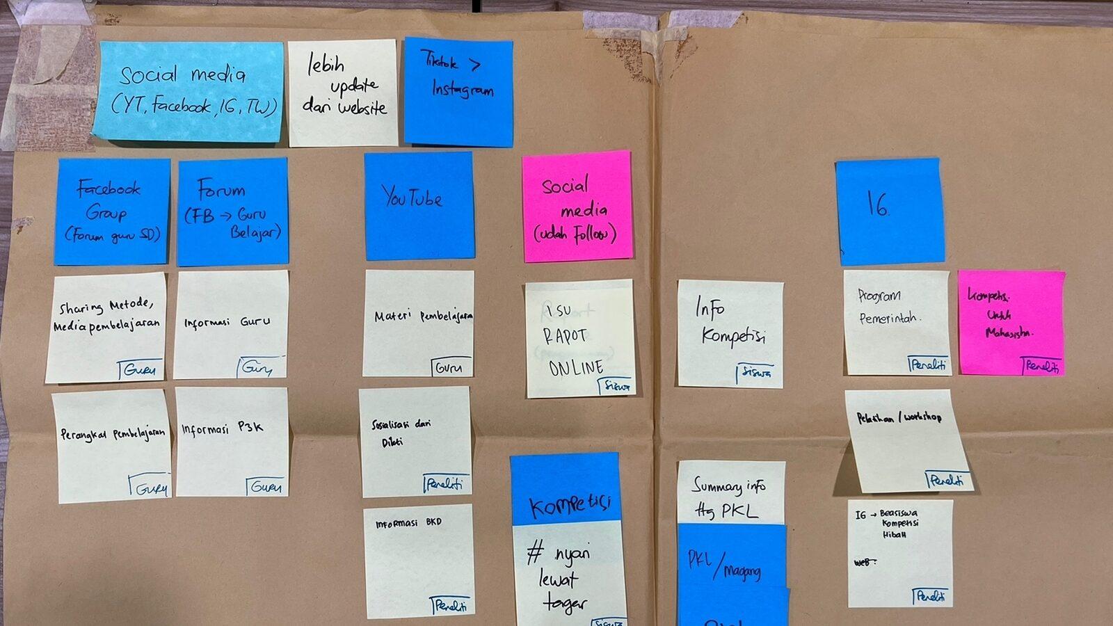
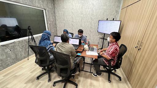
We spoke with our users through two FGD (focus group discussion) sessions. The first session used an exploratory approach to gather user preferences while seeking information and determine what information is essential to them. The second session used a generative approach to gather more ideas for our interaction patterns and information architecture concept.
Information Architecture Design
During the FGD sessions, we identified the design directions we will follow throughout the project. We will design our information architecture with the mindset of a lobby since each main department has established its information channel. We will provide essential information on our website and easily guide users to the correct places.
Wireframing Process
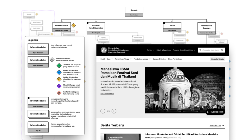
As our users can access the Kemdikbudristek website from various sources, consistency and familiarity were important considerations when designing website interactions. To achieve this, we deliberately limited the number of interaction patterns and created a specific grid system so that users could easily understand where certain functions would be located. Additionally, we avoided using pop-up based interactions as they can harm the analytics performance.
Design Handover
We understand that no matter how well we design the website, it still needs to be supported by good-quality content. From the choice of images to the content tagging, these will affect our users’ experience while looking for information. To address this, we provided our clients with documentation in the form of a project brief, which serves as a guide for them while managing their content.
The Results
We redesigned the website’s information architecture and managed to simplify its current content. The new design is concise and modular, fits with user behavior, and is flexible to any future changes. Here are some interesting findings about our users that influenced the decisions we made.
- Our users perceive the website as a valid source of information, but they do not use it as their main source. Instead of seeking information through websites, they rely on social media or internal channels such as WhatsApp groups. When there is a need for fact-checking, the website becomes their top choice.
- Users’ preferences in grouping existing information depend on their intensity and intent while accessing it. For example, users who need to access a specific service prefer a more personalized structure so they can easily position themselves.
Consultant in-charge

Chin Butkotler
Project Oversee

Gilang Nur A’idi
Interaction Designer

Daniel Fandra
Research Ops

Michelle Susanto
Project Lead

Catharina Krisanti
User Researcher
See more our similar works
Collaborate with us!
Looking for ways to transforming your business?
Get in touch with us!
