Kaders, or community health care workers, displaying their accounts in the Kader Kita app after completing training and registration. Photo: Kader Sehat Surabaya/Intan Purnama Sari.

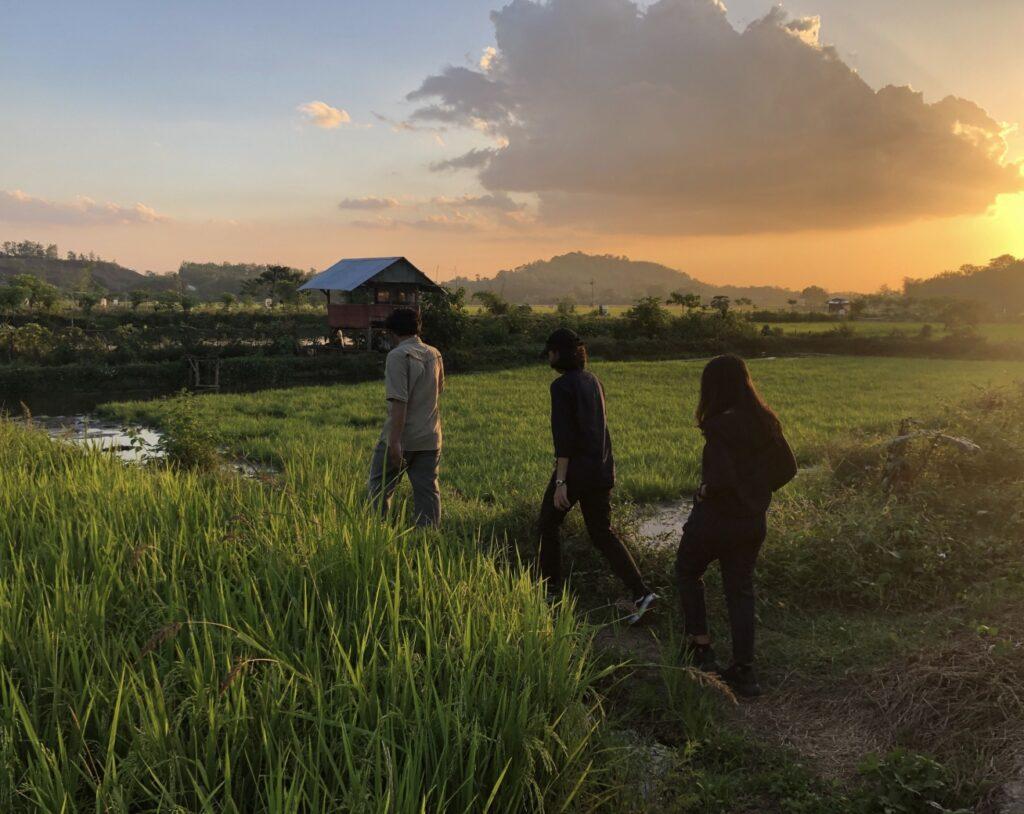
In Indonesia, where there is a shortage of healthcare professionals, community health workers, or cadres, play a vital role as to support delivery of Primary Healthcare Services in Indonesia. This project aims to empower cadres with digital decision support tools to help them perform their jobs better in serving the community.

The Impact

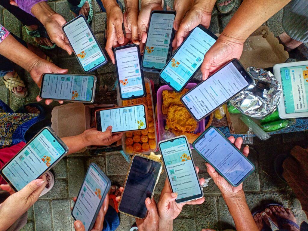
As of 30 June 2025, the app has been downloaded and activated by 2,230 cadres, out of a total 2,351 registered cadres (95% activation rate) in Keerom and Surabaya. Among them, 1,442 cadres (64%) have actively used the app to record real community health data. Through the impact evaluation, we started seeing behavioral changes shown by cadres (e.g., more accurate & complete health data input, more confidence in providing advice and referrals) and by the community (e.g., exercising and adjusting their diets after reviewing their screening results).

Our Approach

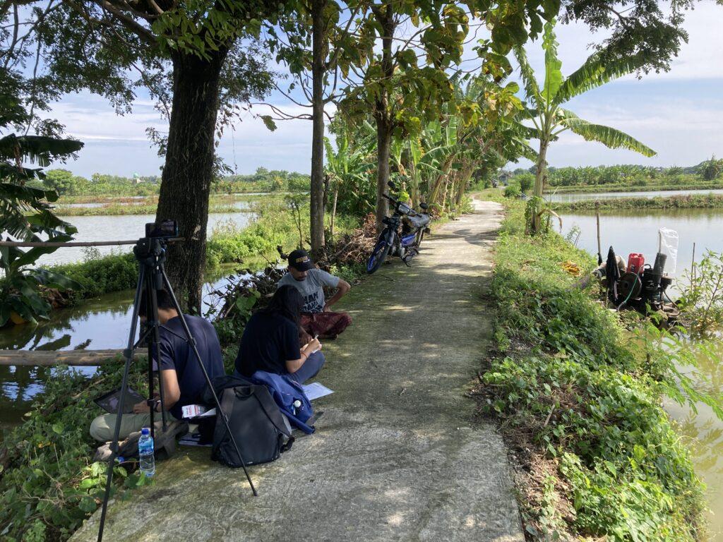
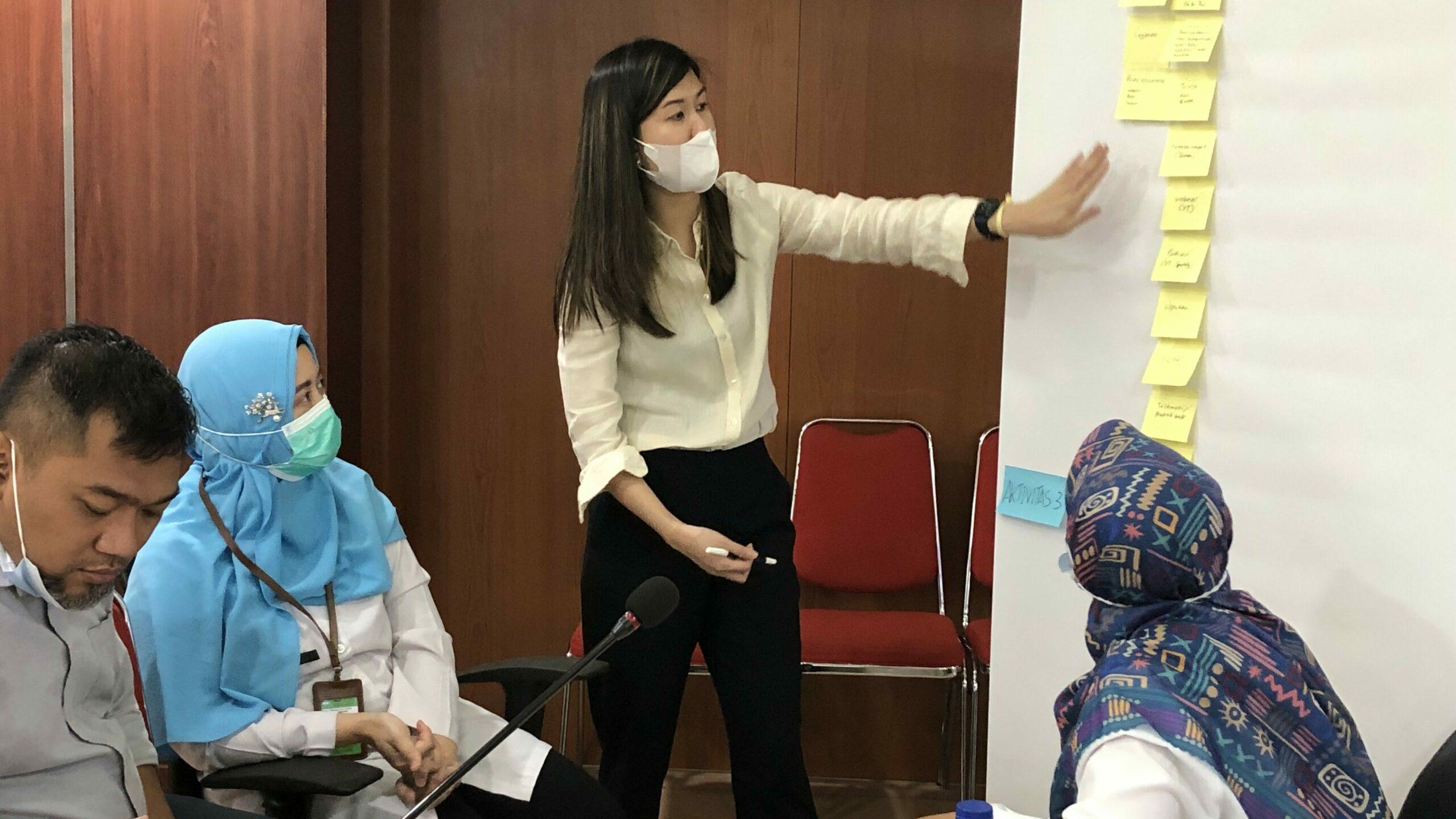
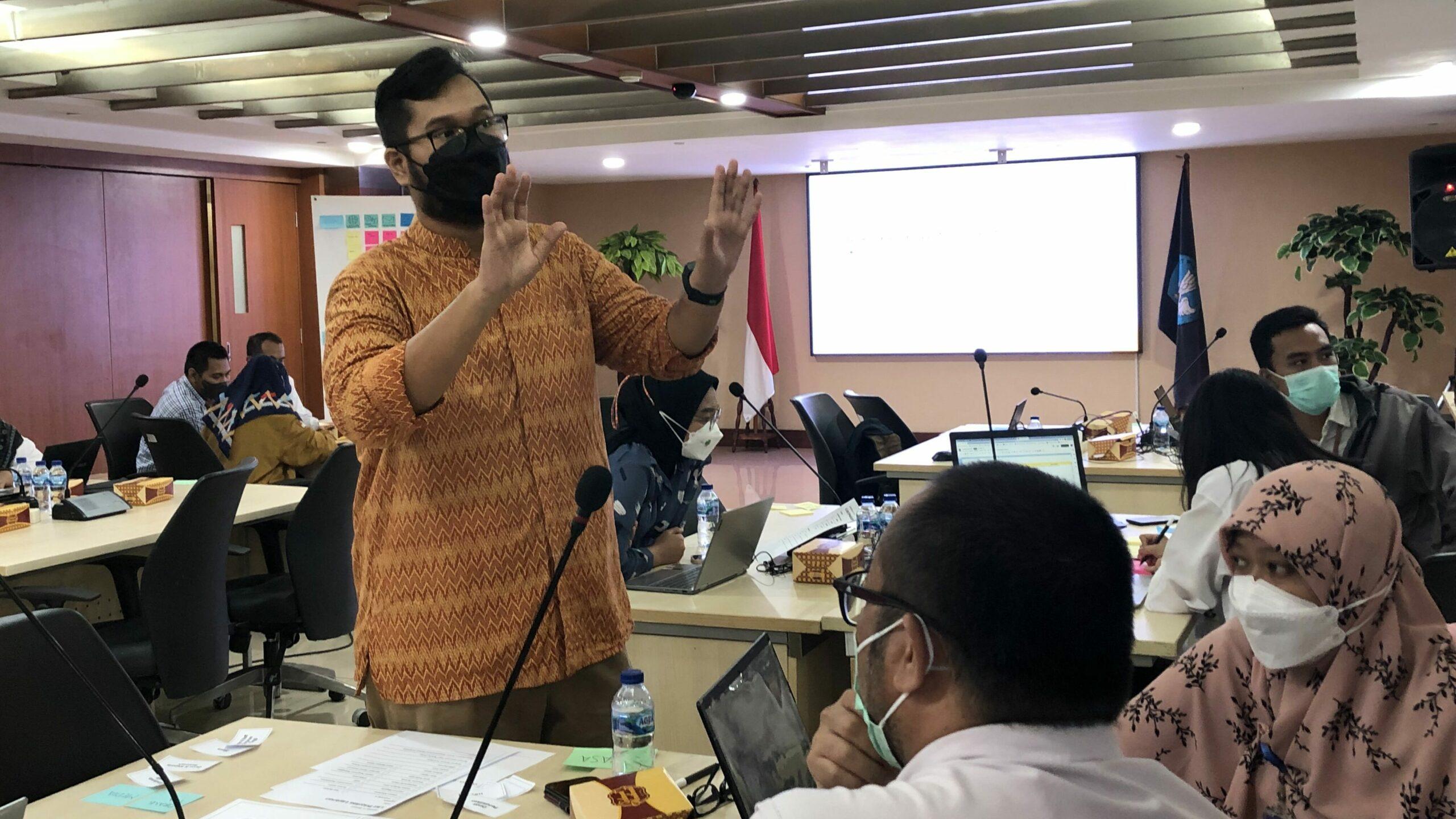
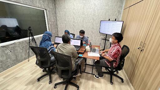
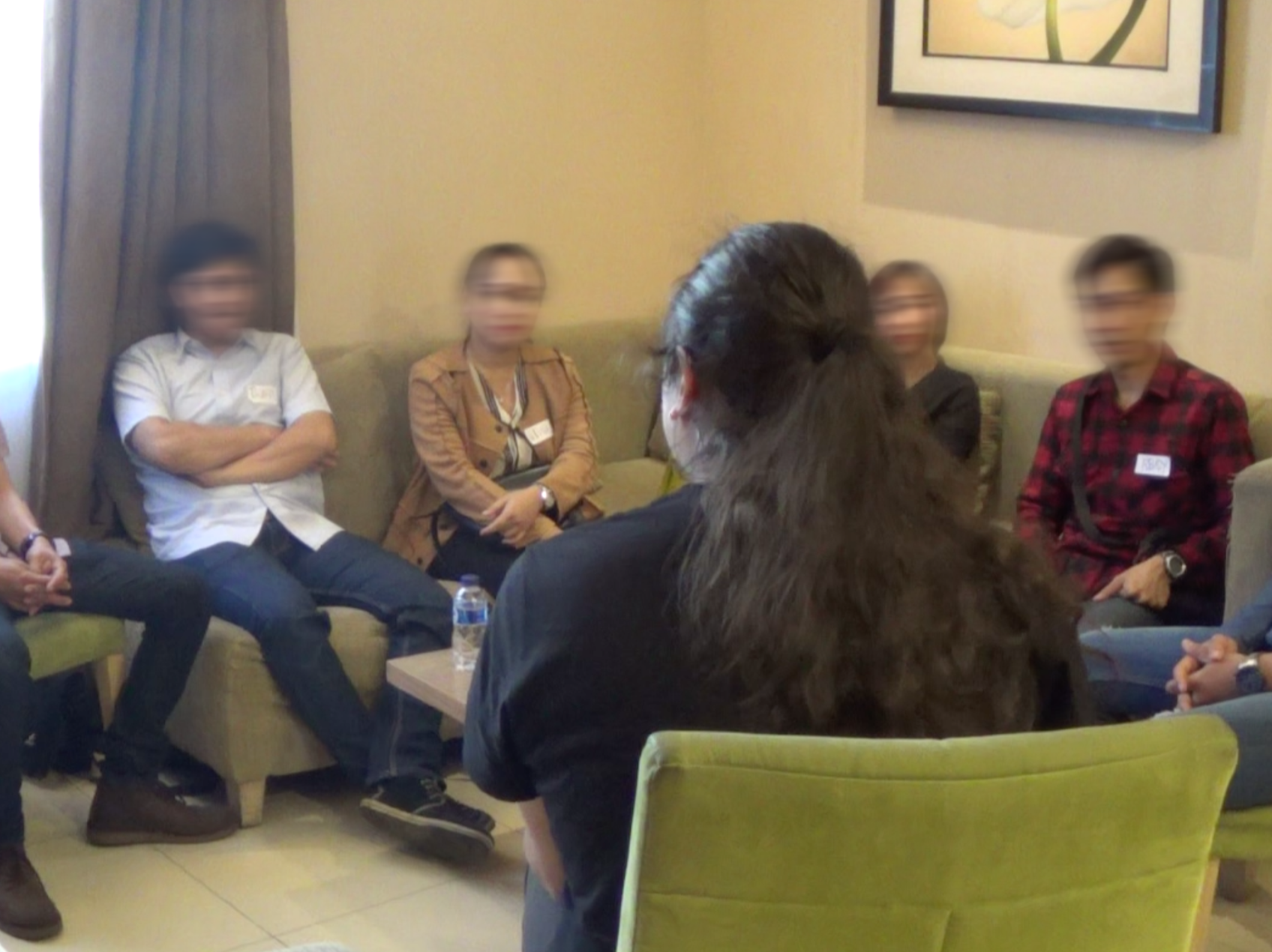
We started by listening deeply through interviews, observations, and co-creation sessions with cadres, healthcare professionals, and key stakeholders — from local leaders to the Ministry of Health. These insights shaped our design of a digital decision support tool, in the form of a mobile app for the cadres, and monitoring dashboard for local leaders and healthcare professionals. The tools were then implemented in Keerom, Papua and Surabaya, East Java. We built support systems (training sessions, video tutorials, and WA) to help cadres feel confident and capable in using the tool. And to understand the real impact, we used the ‘Most Significant Change’ framework and mapped stories from cadres, communities, and supervisors with Theory of Change.

Kader Kita mobile app for cadres and monitoring dashboard for local leaders 
Iterative sessions with cadres, healthcare professionals, and local leaders in Keerom & Surabaya
Introduction of the KaderKita digital tool to local leaders and cadres 
Cadres using KaderKita app during a home visit.  

Our Journey and Process

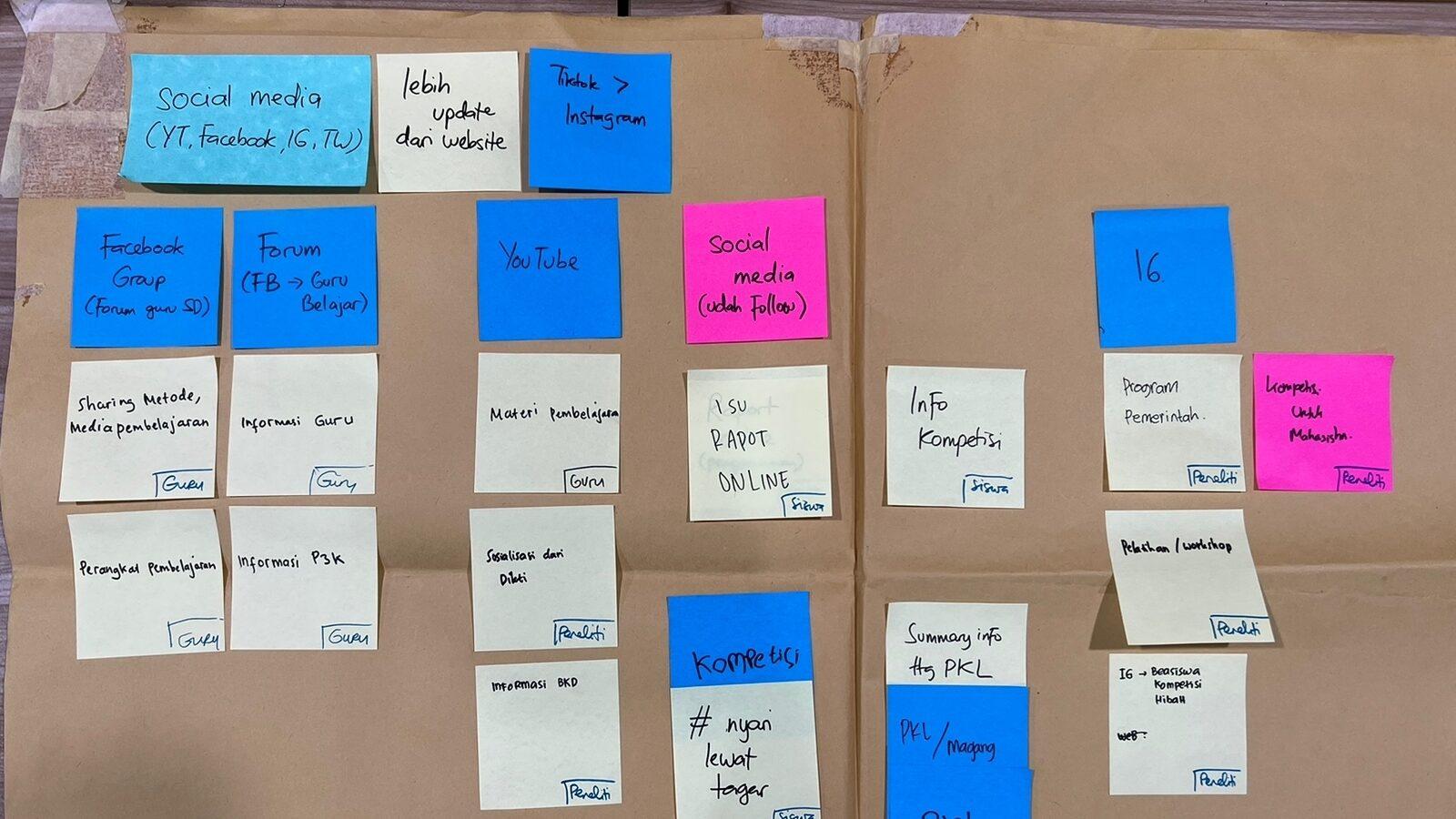
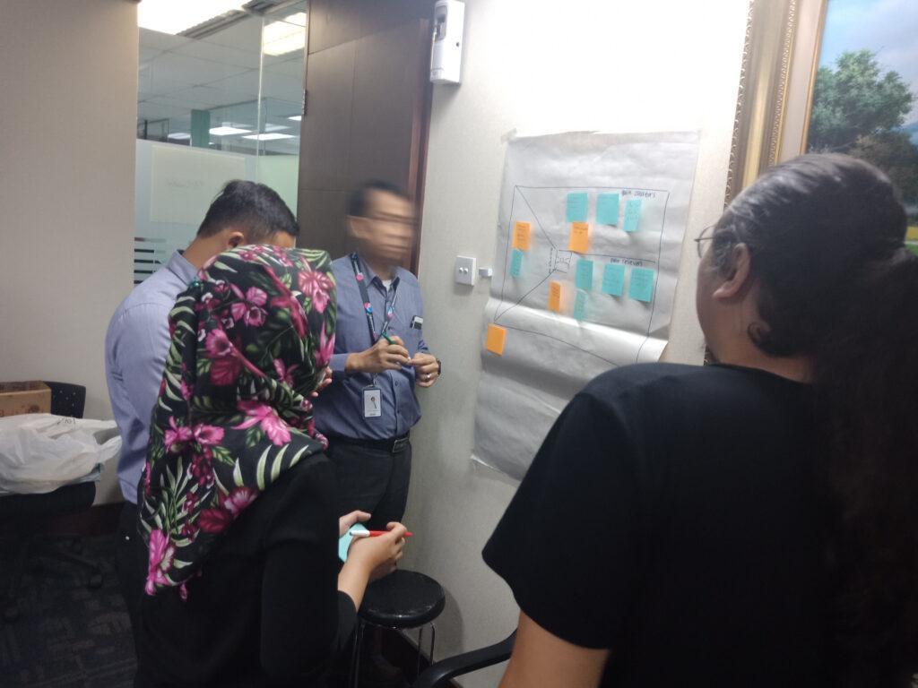
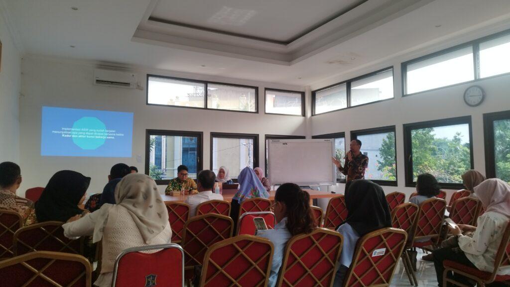
Immersion & co-creation

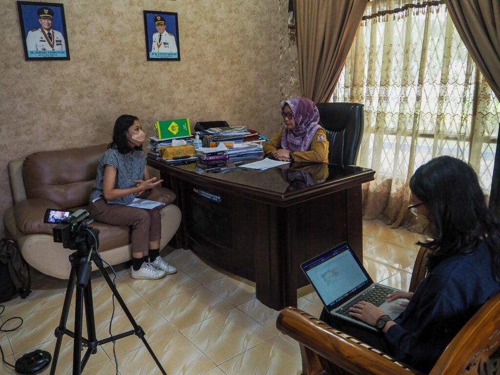
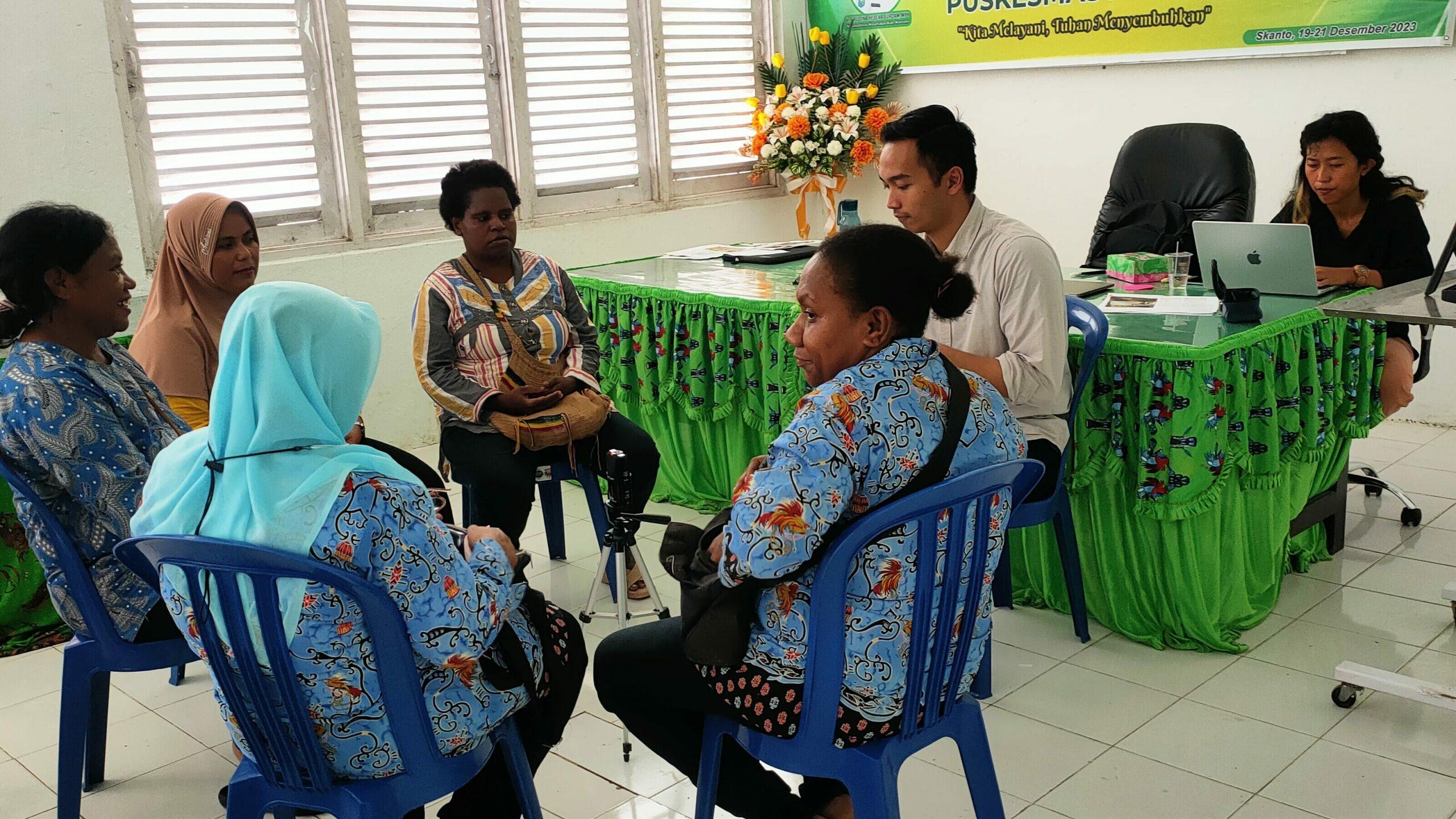
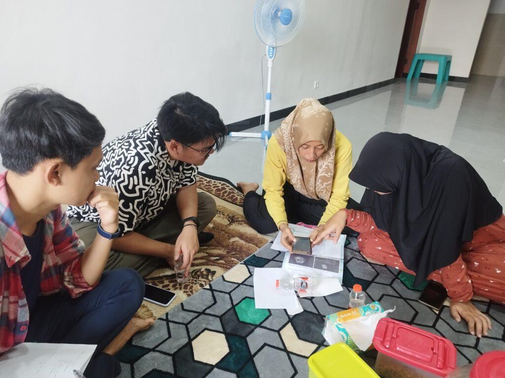
We began by mapping the Primary Health Care systems in Indonesia and the roles of cadres through a co-creation workshop with the Ministry of Health and Center for Data and Information Technology. We then immersed ourselves into the world of cadres, through observations, interviews, and co-creation sessions with cadres, healthcare professionals, as well as local leaders, District Health Offices in rural Keerom (Papua) and urban Surabaya (East Java). The insights shaped our understanding and helped us envision how a digital tool could help empower cadres to do their work easier and more effectively. We created systems maps, personas, concepts, and envisioned future scenarios.

Design & development

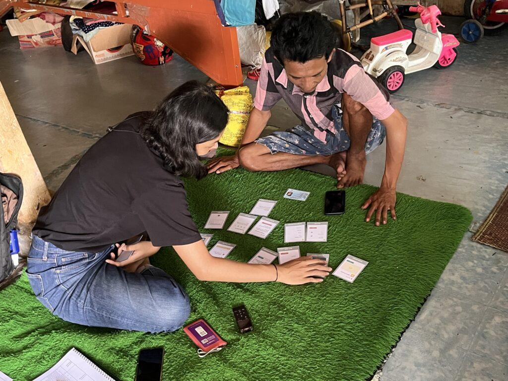
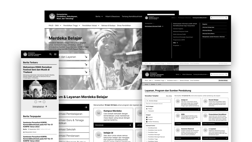
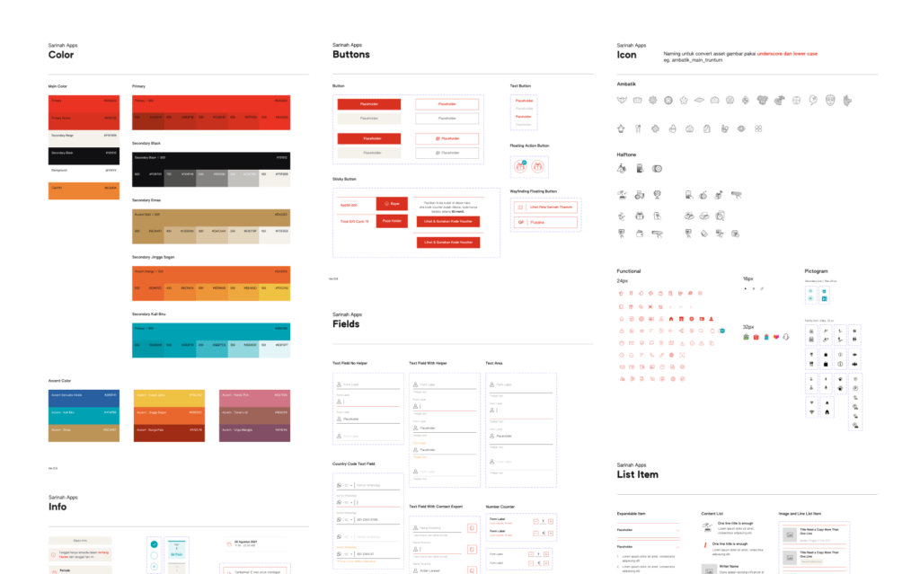
We then designed wireframes of the digital tool, and tested the low-fidelity prototypes with cadres and stakeholders in Keerom and Surabaya. Based on the learnings, we iterated the design and created high-fidelity UI design. We also worked closely with the Health Promotion team of the Ministry of Health to translate the latest health survey forms to ensure the content aligns with national standards, and with the local District Health Offices to include local needs from each specific area. Together with our development partner, we developed the mobile app for cadres and monitoring dashboard for local leaders. 

Implementation

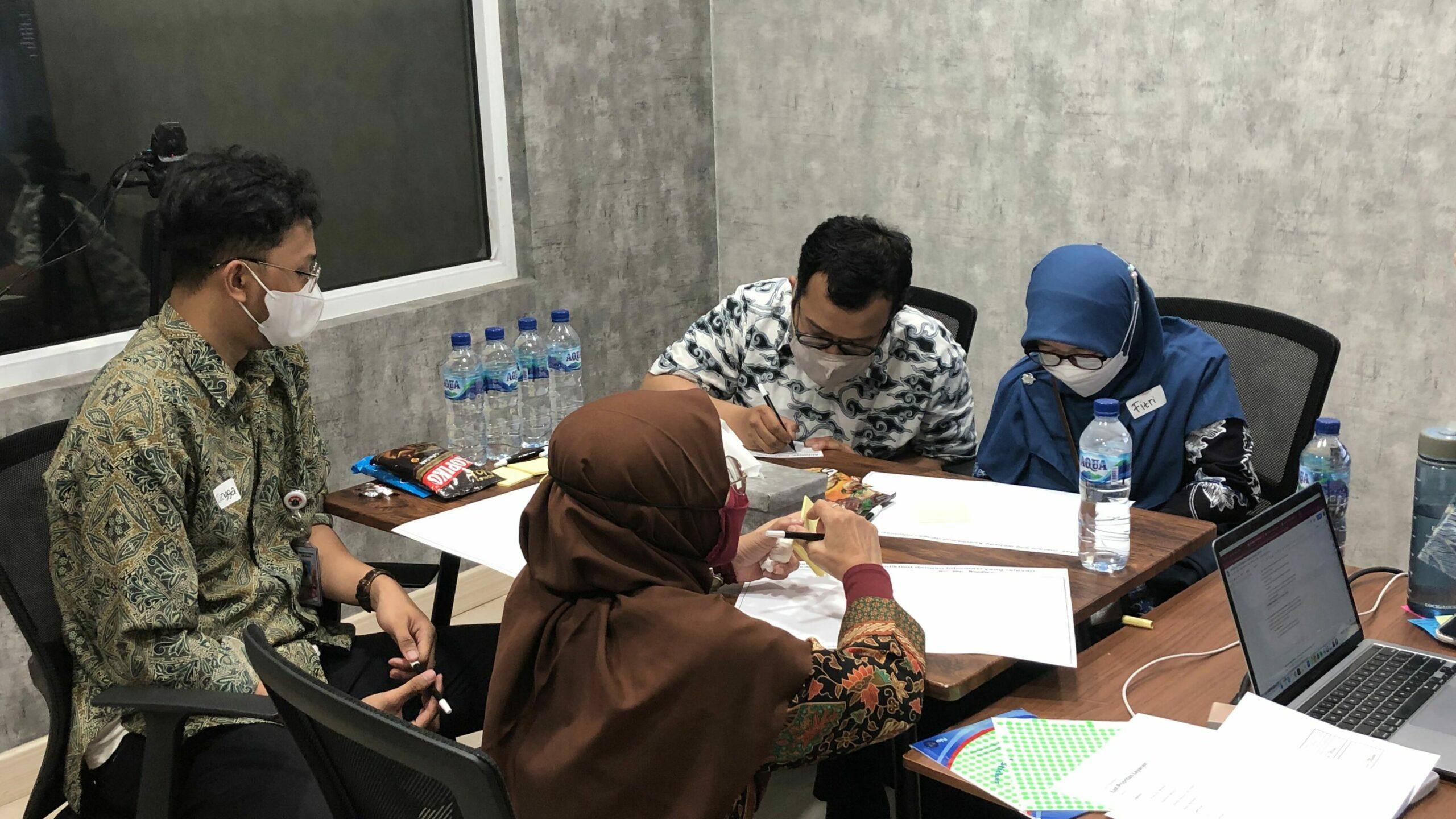
The tool was implemented in Keerom and Surabaya. To support this, we created a change management strategy, developed the trainer program, and involved key leaders to endorse and encourage the tool. To help cadres feel confident and supported, we created a support system, including training series, Help Desk via WhatsApp, video tutorials, online guide and FAQ site. 

Impact evaluation

We gathered stories from 88 cadres, supervisors, and community members in Keerom and Surabaya to evaluate the impact of the digital tool, using the Most Significant Change framework. Through this, we identified initial behavioral changes, such as improvements in cadres data input and health monitoring, and higher confidence in providing advice and referrals backed by the app’s decision support features. 

Mobile app for cadres
Monitoring dashboard for local leaders and healthcare professionals
Support system during implementation phase

The Results

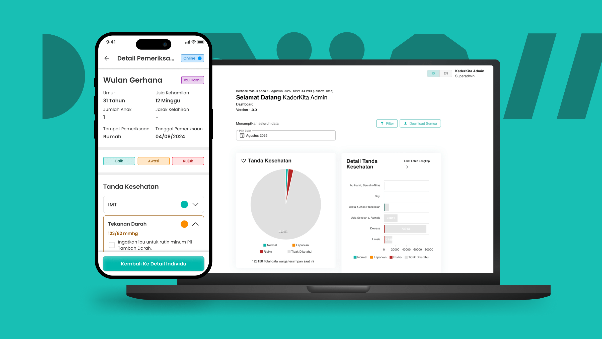
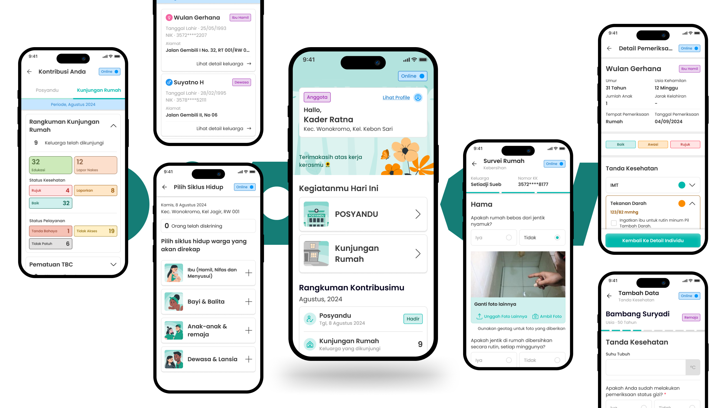
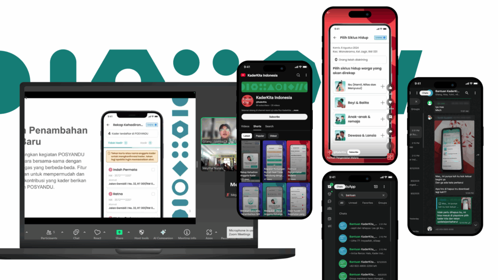
We built a digital decision support tool, in a mobile app, with key features including:

  • Offline mode for areas with low connectivity, like rural Keerom in Papua
  • Community data recording and health screenings at Posyandu and home visits for every life stage, from pregnant mothers and babies to the elderly, as well as family and home risk assessments. All these complete with status indicators and recommendations for referrals
  • Tools for cadres to track their performance and key contacts for emergencies
  • Learning modules covering 25 core competencies for integrated primary healthcare, helping cadres grow and improve.

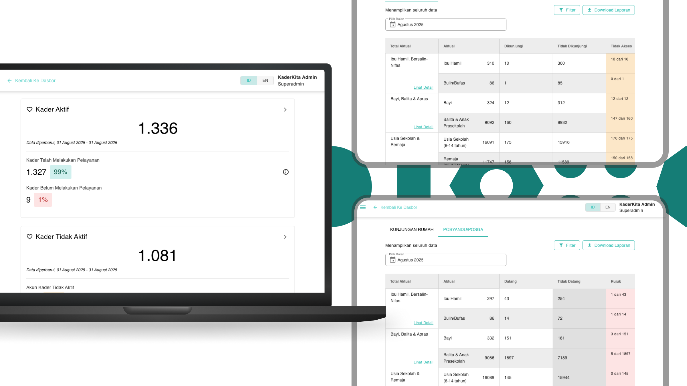
We also built a dashboard monitoring and content management system. It gives health offices and local leaders a clear view of health status in each area, cadres’ activities and performance, and community data. It also helps manage health content and user access seamlessly.


Consultant in-charge

ketut-sulistyawati

Ketut Sulistyawati

Project Oversees

Bhagaskara Setiawan

User Researcher

Gilang Nur A’idi

Interaction Designer

Ryan Nugraha

Project Manager

Putri Purnomo

Lead Designer

Daniel Fandra

Research Ops

See more our similar works

Collaborate with us!

Looking for ways to transforming your business?
Get in touch with us!

The project aims to identify key challenges and opportunities in the onboarding process and produce actionable and localized insights that directly benefit digital financial inclusion activities. Unbanked and underbanked included here are farmers, informal workers, micro-entrepreneurs, and economically inactive (Students & Wife). The project also focuses on more rural areas where the conventional banking infrastructure is typically lower. The research is done in parallel in 4 different countries which has big number of unbanked underbanked population: Indonesia, India, Bangladesh and Uganda.

The Impact

We shared the research results in different dissemination forms with different relevant stakeholders, such as 1-on-1 sharing sessions with partnered key players, conference talks, and sharing series such as:

  • 1-on-1 sharing session with more than 7 different service providers and relevant stakeholders
  • Speaker in UXA Masterclass Conference 2023 in Spain (120+ attendees)
  • Speaker in Somia Conference 2023: System Thinking in Design (120+ attendees)
  • Visionary Talk and Exhibition Booth in Indonesia Fintech Summit 2023 (3000+ visitors)

Our Approach

The research is conducted in 3 provinces: North Sumatra, East Java and South Sulawesi, as representative of the west, central and east region of Indonesia to best represent the geographical context. This locations are selected as they have barriers in limited banking infrastructure, low economy and financial literacy but have good internet penetration and digital availability as the basic requirements of the adoption. 

The thick research uses an ethnographic approach to discover and document the onboarding journey of different segments in different services (agri-tech, mobile & digital banking, digital wallet, digital lending, QRIS, and government aid – PKH & Prakerja).

ECOSYSTEM & STAKEHOLDER LEVEL

As support systems and infrastructure are crucial in digital financial services adoption, we started by understanding the context and mapping the ecosystem. This includes observing the infrastructure in the system, their roles, the communication used, etc. From our initial landscape mapping, we identified several key stakeholders and gathered data through transect walk, shadowing, and in-depth interviews with key government and service providers stakeholders.

PRODUCT AND PERSONAL LEVEL

Understanding the products / services used and deep dive into the target group context, literacy and behaviors towards DFS as well as the detailed onboarding process. In this phase, we also dug deeper into findings from the ecosystem mapping and stakeholder & provider discovery. The data was collected from various methods such as intercepts, Focus Group Discussions, shadowing, fly on the wall to In-depth interviews.

Interviewing respondents in their farming land
Using stimuli to get honest reaction during the session
Talking to the local government to get the different point of view

Our Journey and Process

Phase 1 Project Visioning & Landscaping

This phase started with detailing the project plan, teams visioning on outputs, outcomes, and methodology. Then, followed with developing partnership strategy and outreach with financial service providers, sampling strategy and framework, design of research tools, IRB approvals submission, and market recce.

Phase 2 Discovery

The phase is divided into 3 rounds of discoveries (field research). In each round, we did the analysis, synthesis, internal learnings workshop, country-wise socialization, feedback and iteration of the research approach.

Phase 3 Compiling Outputs and Dissemination

In the end phase of the project, we did analysis and sense making across all the three rounds of the discovery by country followed with compiling the global cross-country learnings. In parallel, we did country wise dissemination and is closed by global dissemination with relevant stakeholders.

Illustration showing the challenges the unbanked and underbanked encounter when doing onboarding process
Delivering insight in the form of financial newspaper and distributing it at Indonesia Fintech Summit and Expo 2023
Sharing the insight in the Inspiration Stage at Indonesia Fintech Summit and Expo 2023

The Results

The insights that we gathered from the research are extracted in different formats, from journey mapping, illustration, and short videos. The key challenges are identified and mapped in each stage of the journey from pre-during-post onboarding, including awareness, perception, consideration, decision-making, and application to usage. 

The understanding of problem spaces in each stage is also equipped with the opportunities collected from good practices observed in the field and design principles as inspiration and to bridge the implementation.


Consultant in-charge

Ketut Sulistyawati

Project Oversee

Uka-q-a-p

Bhagaskara Setiawan

Partnership Lead

anindya-fitriyanti

Gilang Nur A’idi

Project Lead

rayi-harjani

Ryan Nugraha

User Researcher

daniel-fandra

Putri Purnomo

Research Ops

See more our similar works

Collaborate with us!

Looking for ways to transforming your business?
Get in touch with us!

Our design approach for Kemdikbudristek website transformations

The transformations of the education system conducted by the Indonesian Ministry of Education (Kemdikbudristek) prioritize fast and accessible information dissemination. In response, the ministry wants us to help them adjust their main website portal so that it can be easily accessed by any stakeholder under their service.

The Impact

With the new directions, we treated the website as the main lobby. Providing its users with essential information and then guiding them to other detailed sources provided by the main department under Kemdikbudristek. The result is an information architecture with a concise and modular information structure that is still adaptable to accommodate future changes.

Our Approach

First, we need to gain buy-in from all involved stakeholders, including the main departments of the ministry. We began the project by understanding the main agendas of each department, the way they disseminate information, and the current information provided on the main website. Since the main goal is to make the website accessible to its users, we also conducted several FGDs (focus group discussions) to validate our findings and explore the needs and behavior of users seeking education-related information.

It is not easy to fulfill the needs of every stakeholder, especially with tight deadlines. Therefore, we decided to design around 20% of the information that is important for the remaining 80% of users while still providing room for future growth and development.

Our Journey and Process

Internal Context Gathering

We conducted this activity through an internal workshop with the 9 main departments of Kemdikbudristek. In addition, we gathered context by inventorying the information presented on the website to determine the type of content and the responsible department.

External Context Gathering

We spoke with our users through two FGD (focus group discussion) sessions. The first session used an exploratory approach to gather user preferences while seeking information and determine what information is essential to them. The second session used a generative approach to gather more ideas for our interaction patterns and information architecture concept.

Information Architecture Design

During the FGD sessions, we identified the design directions we will follow throughout the project. We will design our information architecture with the mindset of a lobby since each main department has established its information channel. We will provide essential information on our website and easily guide users to the correct places.

Wireframing Process

As our users can access the Kemdikbudristek website from various sources, consistency and familiarity were important considerations when designing website interactions. To achieve this, we deliberately limited the number of interaction patterns and created a specific grid system so that users could easily understand where certain functions would be located. Additionally, we avoided using pop-up based interactions as they can harm the analytics performance.

Design Handover

We understand that no matter how well we design the website, it still needs to be supported by good-quality content. From the choice of images to the content tagging, these will affect our users’ experience while looking for information. To address this, we provided our clients with documentation in the form of a project brief, which serves as a guide for them while managing their content.

Information Architecture and Wireframe as our deliverables

The Results

We redesigned the website’s information architecture and managed to simplify its current content. The new design is concise and modular, fits with user behavior, and is flexible to any future changes. Here are some interesting findings about our users that influenced the decisions we made.

  • Our users perceive the website as a valid source of information, but they do not use it as their main source. Instead of seeking information through websites, they rely on social media or internal channels such as WhatsApp groups. When there is a need for fact-checking, the website becomes their top choice.
  • Users’ preferences in grouping existing information depend on their intensity and intent while accessing it. For example, users who need to access a specific service prefer a more personalized structure so they can easily position themselves.

Consultant in-charge

chin-bw-2

Ketut Sulistyawati

Project Oversee

Bhagaskara Setiawan

Interaction Designer

Gilang Nur A’idi

Research Ops

michelle-susanto

Ryan Nugraha

Project Lead

Putri Purnomo

User Researcher

See more our similar works

Collaborate with us!

Looking for ways to transforming your business?
Get in touch with us!

Sarinah Mobile App Design
Client Sarinah
Project Duration 3 months
Project Location Indonesia

Sarinah is the first historical retail store in Indonesia and used to be an icon for older generations. To stay relevant in the present, Sarinah did a total transformation from its building to branding to attract more customers, especially the younger generation. One of the strategies is to develop mobile apps as part of digital brand activation and transform customer experience into a loyalty program.

The Impact

As part of the brand activation channel, Sarinah app needs to have strong branding and visual design representation. Combining a modernized ‘Ambatik’ icon, we managed to present the Sarinah app in a unique way that caters to its new brand direction without leaving the noble values of Indonesia. The new Sarinah App has led to the first phase of integrated Loyalty Program, promoting Indonesian SMEs as part of their mission.   

Our Approach

The goal is to find balance and harmony in different visual preferences according to multiple generations. Most of our explorations have involved an editorial design approach without forgetting the UIUX rules. We’re responding to these challenges by conducting several Usability Testing with 3 different target groups (Gen X, Millennials, and Gen Z) to understand all their aspirations, then conversing with our key stakeholders to understand the business directions and company visions. 

We also come upon the new branding, architectural, and interior elements to understand the new Sarinah transformation. Connecting and re-learning the importance of Sarinah from the experts has helped us to create a digital experience that feels cohesive with prideful Indonesian elements.

First visual direction of premium and preserve looks
Second visual direction of bold, pride, and rebellious
Information Architecture, Wireframing, and Usability Testing with respondents

Our Journey and Process

Visual Direction Exploration

We start exploring two distinct and extreme visual directions, mainly focusing on how editorial design looks to get premium and modern feelings. Visualize Sarinah as a feminine and elegant figure based on its background story or embrace its new and hype culture.  

Stimuli Creation

We connected those explorations to a group of both suitable and opposite keywords in the form of emotional cards. We also prepared the complete wire-flow design of the app features based on scenarios.

User Testing

The aim is to align different preferences and aspirations between 3 generations towards current vs new Sarinah. Within our stimuli, we have managed to get early feedback, validate our assumptions, and clearly understand the gaps between its vision and users desire.

Design Assets

From both customers’ and stakeholders’ insights, we adjusted the two distinct visual directions to represent Sarinah’s branding keywords. We came up with new iconography and “Ambatik” illustrations for modern ethnic representation of Indonesia that also resonates with its culture and story of Sarinah.

Design Handover

Not to forget, while we design the app, we ensure every component follows the atomic design principle. The intention is to have reusable components, to be easily implemented and expanded into other digital channels and their next business phases.

Onboarding
Homepage
Sarinah Gift Voucher
Discover Sarinah Thamrin
Design elements and the philosophy
Design Assets and Design System

The Results

We built modular and strong uniformity of Sarinah App visual elements to other mediums such as digital and physical gift voucher design. Our final visual directions came with an adventurous and rebellious feeling that resonates with the youngsters while maintaining the preserve, premium, and elegant looks to stay connected with the older generations. 


Consultant in-charge

Uka-q-a-p

Bhagaskara Setiawan

Project Oversee

Catharina-krisanti

Gilang Nur A’idi

Interaction Designer

Ryan Nugraha

Project Lead

gilang-nur-aidi

Putri Purnomo

Interaction Designer

See more our similar works

Collaborate with us!

Looking for ways to transforming your business?
Get in touch with us!

Pinang Ceria Mobile App Design
Client Bank / Financial Service
Project Duration 8 weeks
Project Location Indonesia

Helping one of the biggest state banks create the first-ever bank-owned digital lending product for two distinctive markets: micro and consumer segment. The micro segment would be focused on unsecured loan products while the consumer one would be credit limit.

The Impact

Both products have been launched with great traction. Micro segment lending application launched in February 2019 and has gained a lot of attention and business impact. From February until December 2019, it has 80% growth month on month, even 241% in July 2019. It also got IT Works Awards for Top Implementation 2019 on Bank Sector, Top Digital 2018 on Lending Apps. Consumer credit limit application launched in December 2019 and has attracted more than 3000 users and got 7000 transactions until March 2020.

Our Approach

To create a banking product in Indonesia we not only need to cater to the customers needs and business objectives but also need to make sure that we comply with the regulation set by Bank Indonesia (BI) & Otoritas Jasa Keuangan (OJK). Therefore from the start we worked closely with all the related parties within the client: business, IT, and the compliance departments. Together we did user research to understand the customers loan related behaviors and also came up with product strategy before creating the detailed interaction design of the products.

FGD Consumer Session
Most participants were unable to continue the task when they faced input controls in the application process
Workshop Session
Micro segment product visual direction

Our Journey and Process

Product Induction & Workshop

We downloaded all the information from the team (prior research, product draft, business objectives, success metrics, even draft calculation formula created by the product team) and also clarified questions we received from studying the documents sent to us. We did this and all other activities twice, since each segment will have one dedicated product.

Workshop

In the workshop, we mapped the hypothetical value proposition of the products. These gain creators, pain relievers, and product & services would not only be used for initial concepts but also for creating branding drafts for the products, since it would be a totally new product and had no ties to any other clients’ product in the past.

User Research & Synthesis

We dug around potential customers’ existing loan journeys with In-Depth-Interview & Focus Group Discussion, whether there were pain points or unmet needs then gathered their feedback for the initial concepts we created. Data we gathered from all the sessions, then we synthesized to shape product strategy, features and communication plan (branding and visual direction included).

UI/UX Design: Low Fidelity & Usability Testing

Product features that came out from the synthesis activity then furtherly developed into low fidelity prototype in the form of clickable wireframes. Wireframe form allows us to focus first on structure, interaction pattern, and usability of the product and quickly test it with potential customers and iterate it before then applying appropriate visual direction to the product.

UI/UX Design: UI Design

We developed UI Design to match visual preferences of each segment. For the micro product we applied a vibrant color tone that is usually found in their surroundings with high affordance interaction elements to accommodate their low digital savviness. For the consumer product we went with a modern & clean look with flat design while still maintaining the affordance of the elements.

The Results

Lending applications are developed not only based on business objectives but incorporating customers behaviors. The results are applications that have specific features that answers customers needs while also still comply with the regulation, such as:

  • We realized that for most people in the micro segment, smartphones were their first computer, and they were only accustomed to applications they use daily: WhatsApp & Facebook. Input control such as radio buttons and switch control are unknown to them. Learning from these findings, we changed our interaction to make sure only to use ones they already knew in those applications.

  • Since they usually have limited amounts of income, the micro segment tends to calculate whether they could afford the loan before applying for it. They do this not by seeing the interest rate, but by comparing the installment they need to pay monthly with their income. To accommodate this insight together with the client we provide backward calculation where customers can apply for a loan based on their maximum monthly repayment capacity instead of the amount.

  • People in the consumer segment who have credit cards have difficulty tracking their credit limit usage since they can only see the details at the end of the credit cycle. The product provides real time tracking on the credit limit they have used so they have better control of it.

Awards & Recognitions

We are very honored and humbled that our solution has been nominated in IT Works Awards


What Our Client Said

Roy Salat
logo-bri

I had a great experience working with Somia. The team was highly dedicated to the project. They gave inspiring solutions from many point-of-views, and the output they produced were amazing. Thanks to Somia Team, keep rocking!!

Roy Salat
Bank Rakyat Indonesia, Digital Micro Proposition Manager


Consultant in-charge

Uka-q-a-p

Ketut Sulistyawati

Interaction Designer

Bhagaskara Setiawan

User Researcher

Ryan Nugraha

Interaction Designer

See more our similar works

Collaborate with us!

Looking for ways to transforming your business?
Get in touch with us!