Providing Better Digital Loan Options for Micro & Consumer Segments of Indonesia
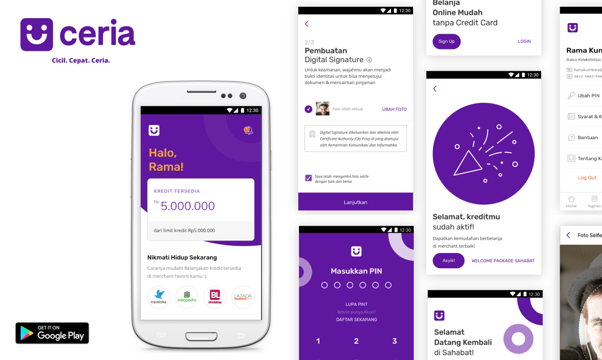
Helping one of the biggest state banks create the first-ever bank-owned digital lending product for two distinctive markets: micro and consumer segment. The micro segment would be focused on unsecured loan products while the consumer one would be credit limit.
The Impact
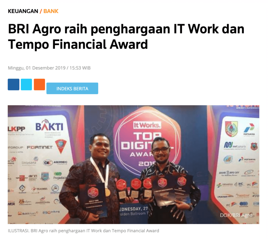
Both products have been launched with great traction. Micro segment lending application launched in February 2019 and has gained a lot of attention and business impact. From February until December 2019, it has 80% growth month on month, even 241% in July 2019. It also got IT Works Awards for Top Implementation 2019 on Bank Sector, Top Digital 2018 on Lending Apps. Consumer credit limit application launched in December 2019 and has attracted more than 3000 users and got 7000 transactions until March 2020.
Our Approach
To create a banking product in Indonesia we not only need to cater to the customers needs and business objectives but also need to make sure that we comply with the regulation set by Bank Indonesia (BI) & Otoritas Jasa Keuangan (OJK). Therefore from the start we worked closely with all the related parties within the client: business, IT, and the compliance departments. Together we did user research to understand the customers loan related behaviors and also came up with product strategy before creating the detailed interaction design of the products.
Our Journey and Process
Product Induction & Workshop
We downloaded all the information from the team (prior research, product draft, business objectives, success metrics, even draft calculation formula created by the product team) and also clarified questions we received from studying the documents sent to us. We did this and all other activities twice, since each segment will have one dedicated product.
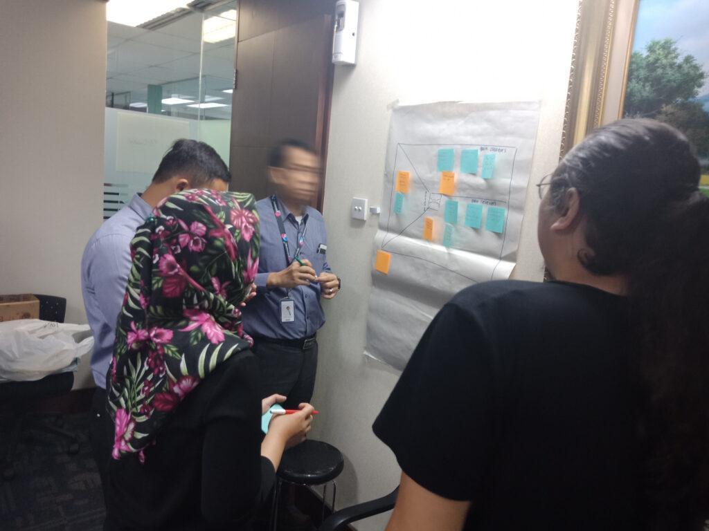
Workshop
In the workshop, we mapped the hypothetical value proposition of the products. These gain creators, pain relievers, and product & services would not only be used for initial concepts but also for creating branding drafts for the products, since it would be a totally new product and had no ties to any other clients’ product in the past.
User Research & Synthesis
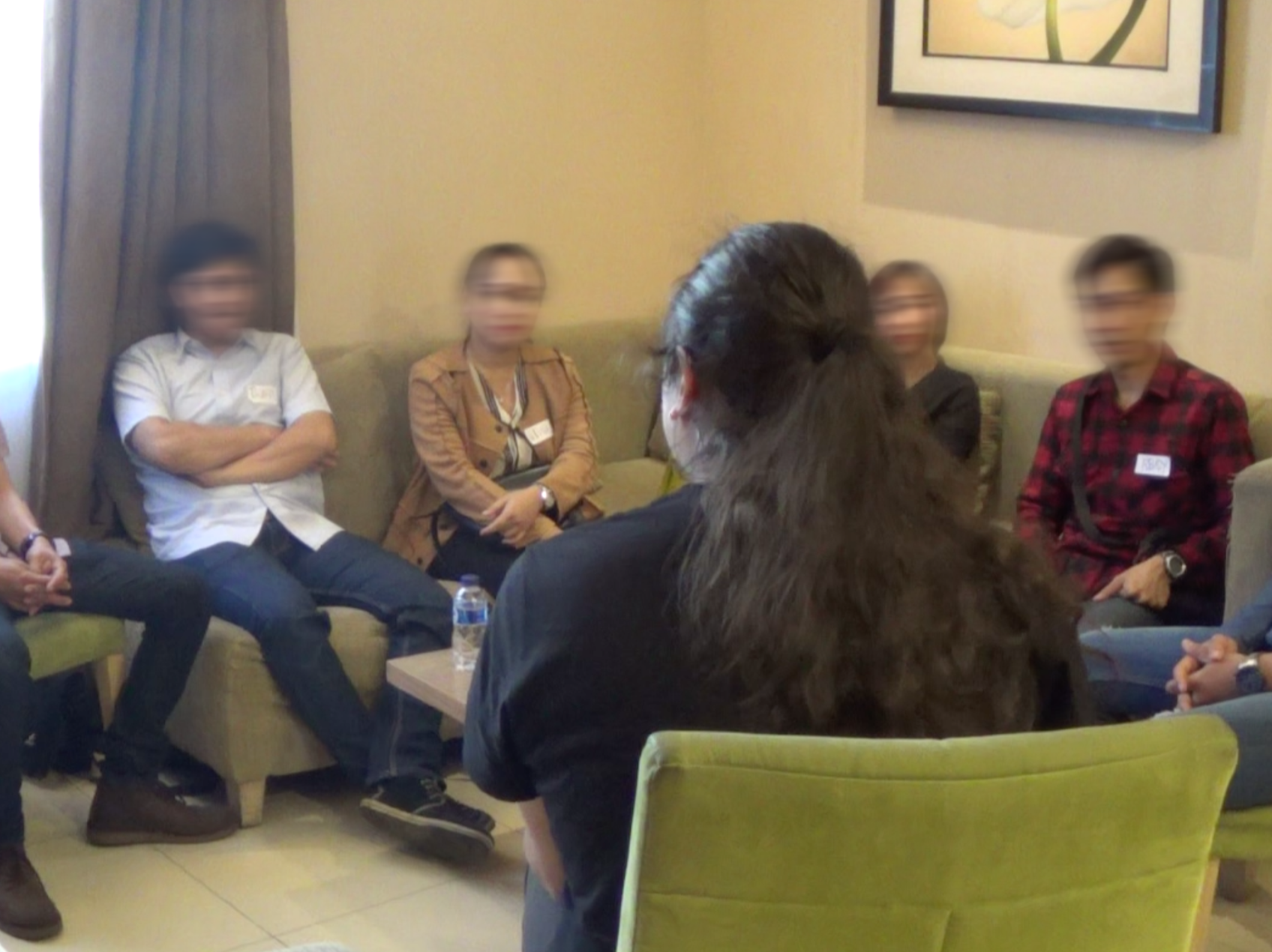
We dug around potential customers’ existing loan journeys with In-Depth-Interview & Focus Group Discussion, whether there were pain points or unmet needs then gathered their feedback for the initial concepts we created. Data we gathered from all the sessions, then we synthesized to shape product strategy, features and communication plan (branding and visual direction included).
UI/UX Design: Low Fidelity & Usability Testing
Product features that came out from the synthesis activity then furtherly developed into low fidelity prototype in the form of clickable wireframes. Wireframe form allows us to focus first on structure, interaction pattern, and usability of the product and quickly test it with potential customers and iterate it before then applying appropriate visual direction to the product.
UI/UX Design: UI Design
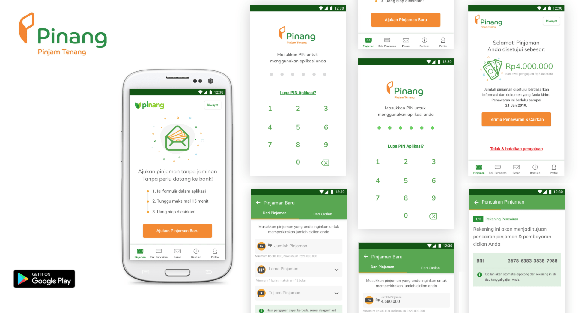
We developed UI Design to match visual preferences of each segment. For the micro product we applied a vibrant color tone that is usually found in their surroundings with high affordance interaction elements to accommodate their low digital savviness. For the consumer product we went with a modern & clean look with flat design while still maintaining the affordance of the elements.
The Results
Lending applications are developed not only based on business objectives but incorporating customers behaviors. The results are applications that have specific features that answers customers needs while also still comply with the regulation, such as:
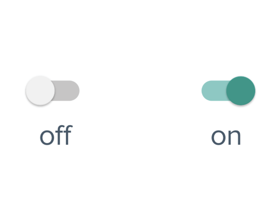
- We realized that for most people in the micro segment, smartphones were their first computer, and they were only accustomed to applications they use daily: WhatsApp & Facebook. Input control such as radio buttons and switch control are unknown to them. Learning from these findings, we changed our interaction to make sure only to use ones they already knew in those applications.
- Since they usually have limited amounts of income, the micro segment tends to calculate whether they could afford the loan before applying for it. They do this not by seeing the interest rate, but by comparing the installment they need to pay monthly with their income. To accommodate this insight together with the client we provide backward calculation where customers can apply for a loan based on their maximum monthly repayment capacity instead of the amount.
- People in the consumer segment who have credit cards have difficulty tracking their credit limit usage since they can only see the details at the end of the credit cycle. The product provides real time tracking on the credit limit they have used so they have better control of it.
Awards & Recognitions
We are very honored and humbled that our solution has been nominated in IT Works Awards
What Our Client Said
Consultant in-charge

Ukasha Q.A.P
Interaction Designer

Mahendra Gudhakesa
User Researcher

Mateus Situmorang
Interaction Designer
See more our similar works
Collaborate with us!
Looking for ways to transforming your business?
Get in touch with us!
